
Introduction
A sticky bottom CTA (Call to Action) is a fixed or persistent element that remains visible at the bottom of a webpage or screen as users scroll. Its purpose is to keep a prominent and easily accessible CTA button or message in view, encouraging users to take a specific action, such as signing up for a service, making a purchase, or subscribing to a newsletter. The sticky bottom CTA improves conversion rates by ensuring the CTA is constantly present, reducing the effort required for users to engage with it, and increasing the likelihood of achieving the desired action.
Figma component - CTA | MVP2 | fixed bottom
All of the bottom CTA types included on this page are the following:
01. Usage & Specifications
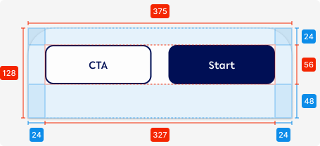
01. Bottom CTA - Single CTA
Variant A - Default
Use this variant for the following scenarios:
-
An action, e.g. confirmation, from the user is needed
-
The user needs to complete another step
Fixed CTA-single-default
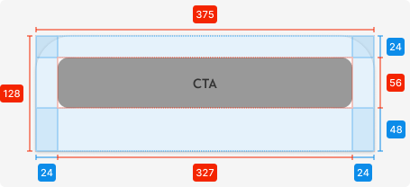
Specifications
Length - 375px (full-screen width)
Height - 128px
Corner radius top left/right -
padding top - SP_3
padding bottom - 2 x SP_3
padding left/right - SP_3
Component - Primary CTA
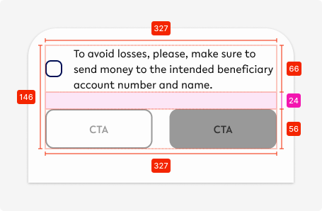
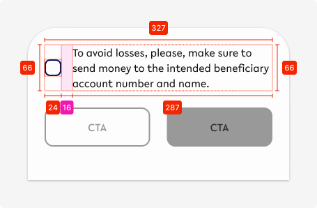
Variant B - Description/ Confirmation
Use this variant for the following scenarios:
-
An action, e.g. confirmation, from the user is needed AND further explanation required
-
Add a checkbox if it’s required for the user to confirm the information displayed (CTA can only be active when checkbox is ticked)
Fixed CTA-single-description
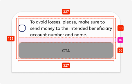
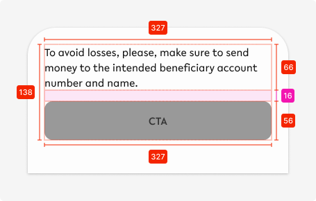
Specifications - Content
Space between elements - SP_2
Description
Text - body1, tertiary-black
Icon - 24x24px, primary-100
Spacing - SP_2
Button
Component - primary CTA
Variant C - Heading and description
Use this variant for the following scenarios:
-
When information needs to be shown to the user within a specific setting (in this case a withdrawal from a interest-bearing account)
Fixed CTA-single-heading
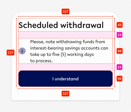
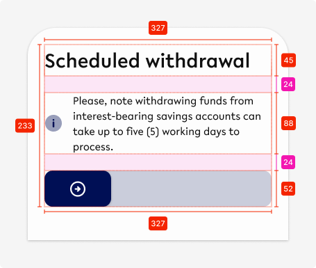
Specifications - Content
Space between elements - SP_3
Heading
Text - heading1, tertiary-black
Description
Text - body1, tertiary-black
Icon - 24x24px, primary-100
Spacing - SP_2
Button
Component - primary CTA OR slider
Variant D - Apply Coupon
Use this variant for the following scenarios:
-
Only to allow users to apply a coupon to a purchase or other part of the app
Fixed CTA-single-coupon
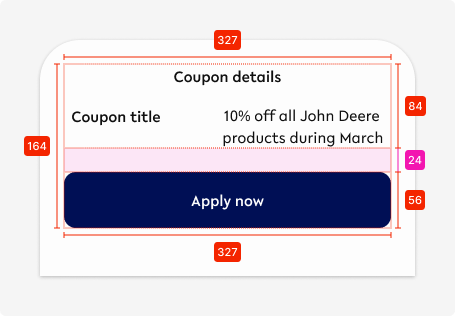
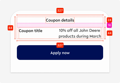
Specifications - Content
Space between text and CTA - SP_3
Heading
Text - display2, tertiary-black, centre-aligned
Space to description - SP_2
Description
Coupon title - display2, tertiary-black
Description - body1, tertiary-black
Space between title & description - Auto (adapts to the size of each element
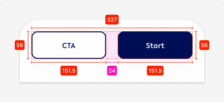
02. Bottom CTA - 2 CTAs
Variant A - Default
Use this variant for the following scenarios:
-
When 2 options are required for the user to choose from, i.e. when a user needs to be able to cancel their action
-
Vertical alignment (buttons on top of each other) ONLY used if copy requires it
Fixed CTA-double-default

Variant B - Description
Use this variant for the following scenarios:
-
Use if it is part of a longer process with multiple steps
-
Use if further information is required do describe the action necessary
-
Use vertical alignment (buttons on top of each other) ONLY if copy requires it
Fixed CTA-double-description
Specifications
Spacing between description & CTA - SP_3
Heading
Text - display2, tertiary-black, centre-aligned
Description
Text - body1, tertiary-black, centre-aligned
Fixed CTA-double-description-vertical
Specifications
Spacing between description & CTAs - SP_3
Description
Text - display2, tertiary-black, centre-aligned
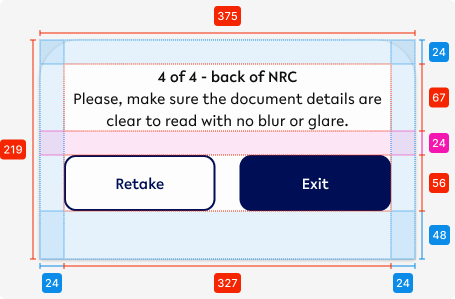
Variant C - Description between
Use this variant for the following scenarios:
-
Use when there are 2 different paths possible moving forward, e.g. signing up or login
Fixed CTA-double-description-between

Specifications
Spacing between description & CTA - SP_3
Description in between
Text - display2, tertiary-black, centre-aligned
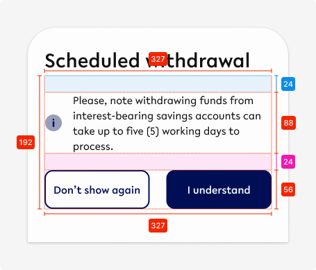
Variant C - Description between
Use this variant for the following scenarios:
-
Use ONLY when the option is allowed for the user to not see the notification again
Fixed CTA-double-description-heading

Specifications
Spacing between elements - SP_3
Heading
Text - heading1, tertiary-black, left-aligned
Icon
Size - 24x24px
Colour - primary
Spacing between icon and description - SP_2
Description
Text - body1, tertiary-black, left-aligned
Variant D - Consent
Use this variant for the following scenarios:
-
Use when the user actively needs to confirm
-
Primary CTA becomes active ONLY when tickbox checked
-
Initial state of checkbox is unchecked with CTA being disabled (Cancel is always available)
Fixed CTA-double-consent
Specifications
Spacing between description & CTA - SP_3
Icon - Checkbox
Size - 24x24px
Colour - primary
Spacing between icon and description - SP_2
Description
Text - body1, tertiary-black, left-aligned
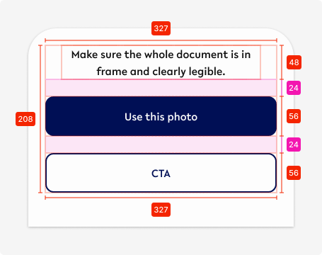
03. Bottom CTA - Camera
Use this variant for the following scenarios:
-
When the user needs to use the native camera
Fixed CTA-camera
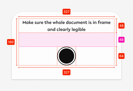
Specifications
Spacing between description & CTA - 48px
Description
Text - display2, tertiary-black, centre-aligned
Icon
Size - 64x64px
Colour - tertiary-black
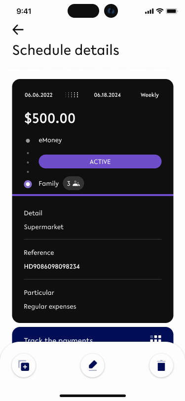
04. Bottom CTA - max. 4 buttons
Use this variant for the following scenarios:
-
More than 2 actions are required to be accessible to the user, e.g. for scheduled payments (cancel, duplicate, edit)
Fixed CTA-Icons
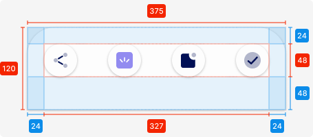
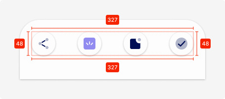
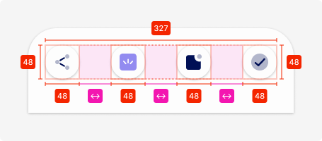
Specifications
Length - 375px (full-screen width)
Height - 120px
Corner radius top left/right -
padding top - SP_3
padding bottom - 2 x SP_3
padding left/right - SP_3
Icons
Size - 48x48px
Amount - 3-4 icons
Spacing between - automatic depending on amount of icons
Colour - secondary1 (can be changed)
02. Interaction behaviour
This depends on if the actions required to display in the bottom CTA are depend on the input of the user or need to be always accessible.
01. Mandatory fields available
-
CTA not visible
All mandatory fields are filled out
-
CTA moves in from bottom middle
After pressing the button
-
It disappears back down
-
It gets replaced by a new CTA IF required
02. When actions need to always accessible
-
The fixed bottom CTA will always stay at the bottom on that particular screen and won’t disappear
03. Accessibility
The standard for accessibility should always be WCAG2.0 - AA compliance for colour contrast and readability of the text.
04. Customisation options for Products
|
Item |
Option A - Whitelabel |
Option B - Restricted custom |
Option C - Fully custom |
|---|---|---|---|
|
Label (text) |
✅ |
✅ |
✅ |
|
Colour palette (fitting the Youtap palette) |
✅ |
✅ |
✅ |
|
Font |
✅ |
✅ |
✅ |
|
Iconography |
❌ |
✅ |
✅ |
|
Typography |
❌ |
❌ |
✅ |
|
Spacing/ Padding |
❌ |
❌ |
✅ |
05. Resources
|
Type |
Link |
Notes |
|---|---|---|
|
Figma file |
|
|
|
WCAG2.0 Checklist |
https://www.w3.org/TR/2006/WD-WCAG20-20060427/appendixB.html |
|