
Introduction
The purpose of a subheader in design is to improve the organization and readability of content. By creating a clear hierarchy and breaking up the material into smaller sections, subheaders help users navigate and understand the information more easily. They highlight key points, enhance visual appeal, and aid in SEO and accessibility. Subheaders play a crucial role in content organization and chunking information, ensuring a more engaging and user-friendly design overall.
Figma component - Modal/Section Display
All the variations of a sub-header are the following:
01. Usage & Specifications
Variant A - Default
subheader-default
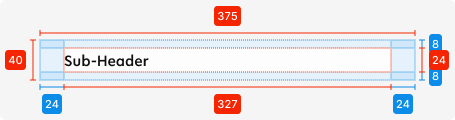
Specifications
Length - 375px (full-screen width)
Height - 40px (24px + 8px top + 8px bottom)
padding-top/bottom - SP_1
padding-left/right - SP_3
Text colour - tertiary-black
Text alignment - left-aligned
Text limit - 1 line
Typography - display2
Variant B - Added icon
Use this variant for the following scenarios:
-
Access information regarding the section is required
subheader-icon
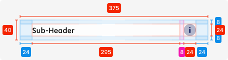
02. Accessibility
The standard for accessibility should always be WCAG2.0 - AA compliance for colour contrast and readability of the text.
03. Customisation options for Products
|
Item |
Option A - Whitelabel |
Option B - Restricted custom |
Option C - Fully custom |
|---|---|---|---|
|
Label |
✅ |
✅ |
✅ |
|
Iconography |
❌ |
✅ |
✅ |
|
Typography |
❌ |
❌ |
✅ |
|
Spacing/ Padding |
❌ |
❌ |
✅ |
07. Resources
|
Type |
Link |
Notes |
|---|---|---|
|
Figma file |
|
|
|
WCAG2.0 Checklist |
https://www.w3.org/TR/2006/WD-WCAG20-20060427/appendixB.html |
|