-
Icons are a critical part of our brand and visual language, and they help users quickly and easily understand the purpose and functionality of our products and services.
-
This documentation provides guidelines and best practices for designing, implementing, and using icons within our digital ecosystem.
-
Our iconography is designed to be accessible, inclusive, and consistent across all platforms and devices.
ACCESS TO STYLEGUIDE: https://www.figma.com/file/F1fNT99VGTJHJ1jAnjFTn6/Youtap-Style-guide-V1.0.2023?node-id=1%3A22&t=SjE1WJmyUFk9CClb-1
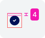
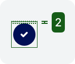
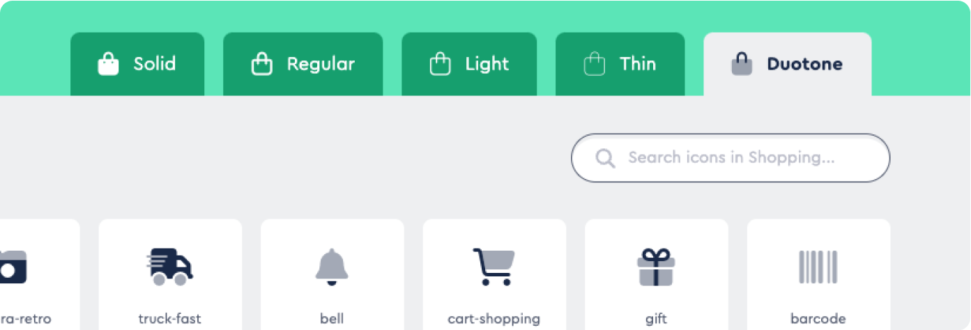
VARIATIONS Finalised
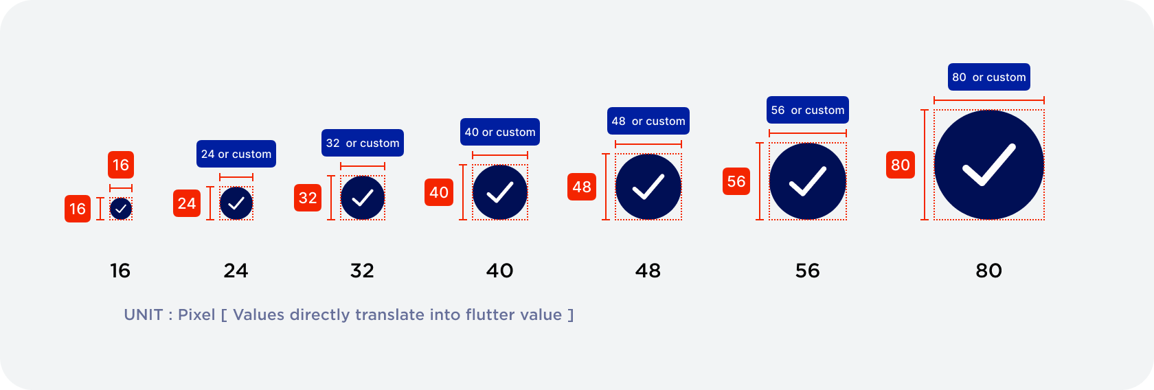
SIZING
CAN DO:
Custom width is allows
[BY STANDARD ICONS ARE TO HAVE 1:1 (width x height) ratio. ]
DO NOT DO:
Customise the height. Please follow the standard height provided OR register new sizing into style.
Refer to table blow.
SPECIFICATION:
|
SIZE TYPE |
WIDTH |
HEIGHT |
USAGE |
|---|---|---|---|
|
Small |
16px |
16px |
Error message / Inline validation |
|
Standard (REM) |
24px |
24px |
|
|
Medium 1 |
Standard 32px Customisable |
32px |
TBC |
|
Medium 2 |
Standard 40px Customisable |
40px |
TBC |
|
Medium 3 |
Standard 48px Customisable |
48px |
TBC |
|
Large 1 |
Standard 56px Customisable |
56px |
TBC |
|
Large 2 |
Standard 80px Customisable |
80px |
TBC |
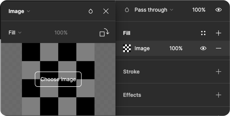
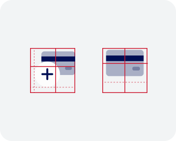
IMAGE ICONS
-
Your Figma image frame component is a versatile icon component, perfect for representing logos and profile pictures. With its user-friendly interface and easy image swapping, it enhances usability and delivers a consistent, intuitive experience for all users.
SPECIFICATION:
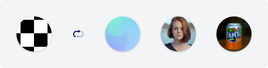
Image format: JPEG or PNG
Dimension: Follows sizing types
Shadow value: shadow-y1
#393945 Hex Value - 25%
|
X |
Y |
Blur |
Spread |
|
0 |
1 |
4 |
0 |
Usage:
-
User’s profile
-
Favourite’s profile
-
Logo - Linked banks
-
Logo - Supported third party service e.g. Akahu
INSTRUCTION:
EMOJI ICONS
-
The emoji component offers a flexible and efficient way to use icons in your designs, allowing for simple changes to the copy content rather than the creation of a new SVG library for each icon for development. With this system, you can easily tailor your icons to your specific needs, making it a great addition to any design system UX.
-
Easy implementation: Emojis can be recognised via Unicode for easy application to the copy content.
By leveraging the Unicode Standard's support for emojis, developers can easily incorporate icons into their app's design in a flexible and consistent manner across different devices and platforms.
/listlist
For example, in HTML and CSS, you can use the Unicode code point to display an emoji as an icon by including the Unicode escape sequence in your code:phpCopy code<span class="icon">💸</span>This code would display the 💸 emoji as an icon.
-
Intuitiveness: Emojis are more universally recognisable and easier to understand than traditional icons, making the app more intuitive for users.
-
More customisation: allowing for simple changes to the copy content rather than the creation of a new SVG library for each icon for development
-
Increased comprehension: The use of emojis in context can aid in comprehension and make the app easier to use overall.
-
SPECIFICATION:
-
Non-Framed Icons
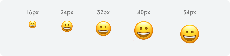
Size: Frame = Text(emoji) size (MAX 54px)
Scaling: 1:1 ratio
-
Framed Icons
Framed Icon is using emoji inside the frame size (following size variations) depending on application
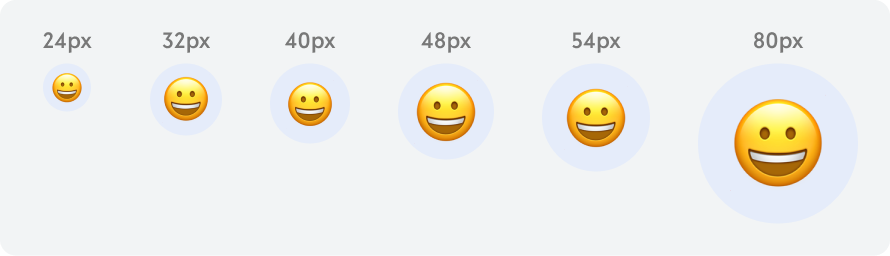
Size: Frame = Text(emoji) size (MAX 80px)
|
FRAME SIZE (px) |
24 |
32 |
40 |
48 |
54 |
80 |
|---|---|---|---|---|---|---|
|
EMOJI SIZE (px) |
16 |
24 |
24 |
32 |
32 |
54 |
Scaling: 1:1 ratio
Colour: Secondary/40% customisable
THEIR USAGE:
|
24px |
As primary action buttons, tab icons, list options |
|
32px |
Important UI elements, such as transaction success or failure messages, indicative purpose |
|
40px |
UI elements that need more attention, such as the app's main navigation menu, or for important screens such as the user's account information. |
|
48px |
Such as a section header or a large call-to-action button. |
|
54px |
Supporting icon for description copy |
|
80px |
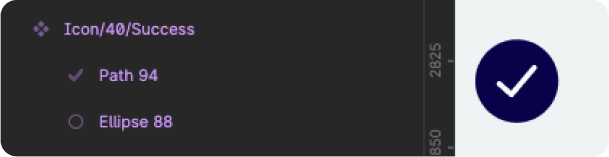
Main indication such as success/fail/pending status indication on full screen status (transaction success screen) |
FORMAT: finalised
VECTOR ONLY
-
To make sure they scale when scaled up or down from REM.
STROKE
-
Thickness of line is to be 2px (REM)
-
Less than 2px is only allowed as text.
-
Other than lines, other shape’s thickness may vary as long as it is framed within.

SPACING
-
Standard spacing to be 2px (REM)

CONTENT CONSTRAINS
-
All contents are to be set to scale
-
The default icons ratio published
are not to change.
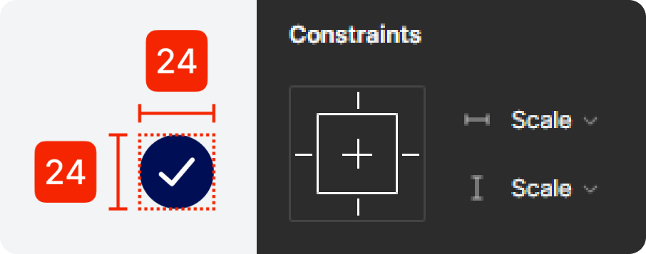
CERTERING
-
Make sure all icons are center
horizontally and vertically
DESIGN PRINCIPLE: Finalised
FRAME:
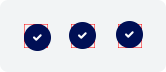
Icon should not be larger than the container frame
-
Container sits either perfectly to the boarder
-
Maximum of 2px offset on at least one of the side
Offset should not be larger tahn 2px on either horizontal or vertical sides.
0 - 2px offset from the containing frame at least on side.
(The frame sizes refers to size variation).
Do not frame the icon away from the center.
Always center the icon in the box.
-
In a case where it is combined of different elements, they should be centered collectively.
Details:
When making 2D custom icon, do not produce over complicated icons
(This excludes the case of emoji icons*)

Simple and maximum of 2 different tones:
1. 100% fill
2. 40% fill
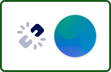
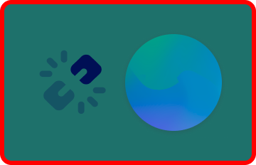
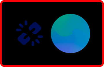
ACCESSIBILITY:
-
Must pass AA contrast
-
Good contrast differentiation
-
Visible shadow
-
AA contrast
-
Bad contrast differentiation
-
AA contrast fail
-
Bad contrast differentiation
-
A contrast fail
-
Icon blending into the background
-
Shadow unrecognisable
Do not use tertiary colour white or neutral colour as icon unless in dark mode*
CODING SNIPS: to be worked on
FUTURE DEVELOPMENT:
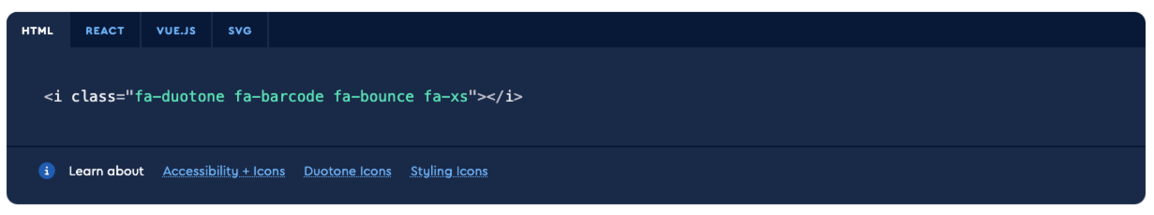
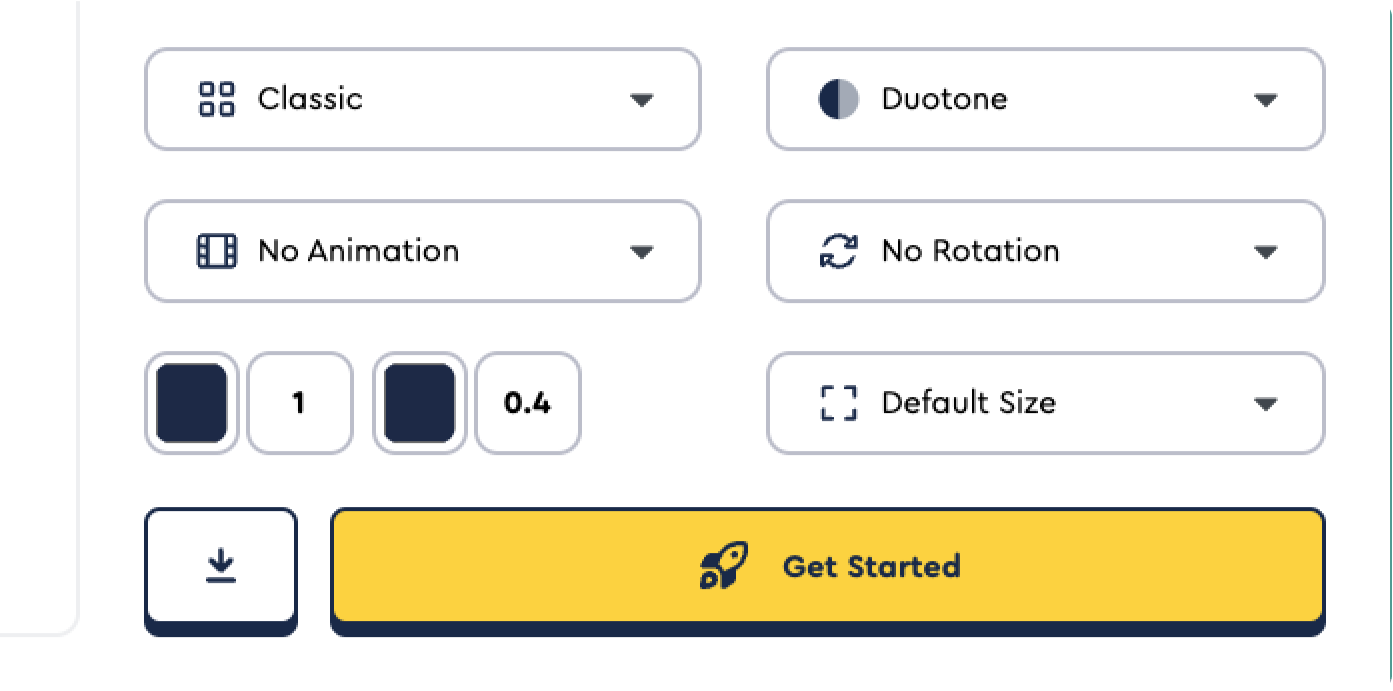
Hosting iconography library on ‘Font Awesome’ for cloud base library and easy development’s integration.
-
Removal of iconography variation management from development library
-
Allows icons to be converted to Unicode, which can be used a hence remove loads of the app for faster experience.
Leveraging the Unicode Standard's support for emojis can provide a flexible and easy-to-use way to incorporate icons into your app's design, while ensuring that they can be rendered consistently across different devices and platforms.phpCopy code<span class="icon">💸</span>This code would display the 💸 emoji as an icon.
CUSTOMISATION
-
Easy CSS customisation
-
Access to their existing icons
-
DUO TONE support
Icon opacity: Font Awesome icons can be made partially transparent using the opacity property of the Icon widget. This property accepts a double value between 0.0 (completely transparent) and 1.0 (completely opaque).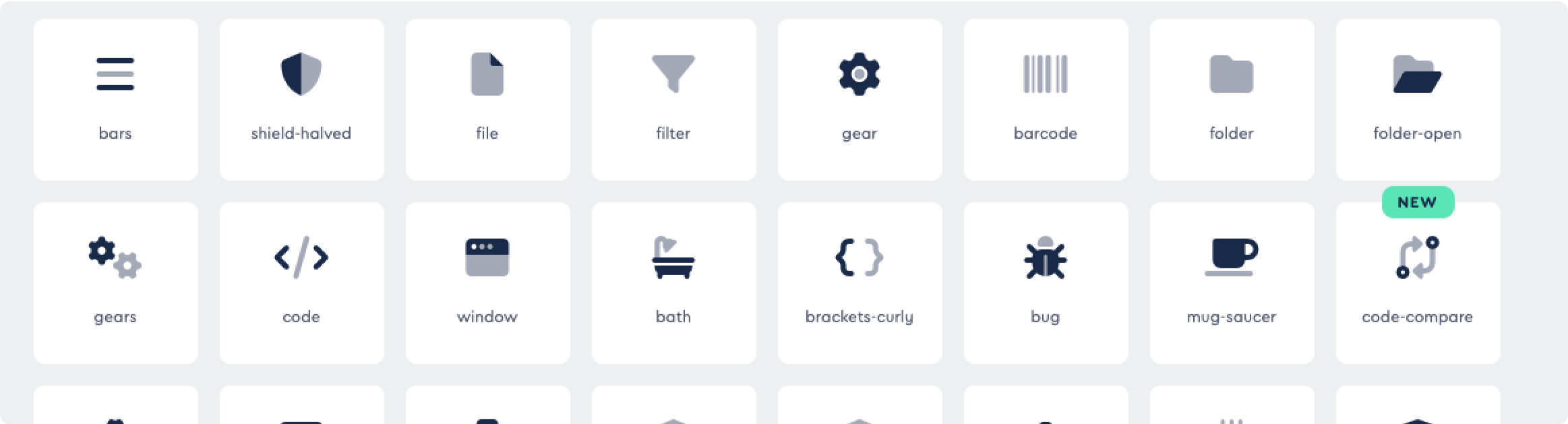
-
Icon rotation: Font Awesome icons can be rotated using the transform property of the Icon widget. This property accepts a Matrix4 object that represents the transformation matrix to apply to the icon.
-
Icon animation: Font Awesome icons can be animated using the AnimatedIcon widget, which provides built-in animations for common use cases such as loading indicators and toggling icons.
-
Coding references are provided