
Introduction
Text input fields are a fundamental element in user interfaces that allow users to input text or data into a digital application or form. Text input fields enable users to provide input for various purposes, such as entering their name, email address, password, or other information, and are commonly used in a wide range of digital interfaces, including websites, mobile apps, desktop applications, and more. Text input fields play a crucial role in user interaction and data collection, as they facilitate communication between users and digital applications.
Figma component - Input fields
This section includes the following:
https://www.figma.com/file/F1fNT99VGTJHJ1jAnjFTn6/Youtap-Style-guide-V1.0.2023?node-id=870%3A69165&t=bSOwWTQGqqzPHGGC-1
01. Specifications
Textfield States
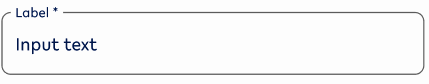
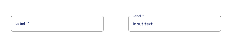
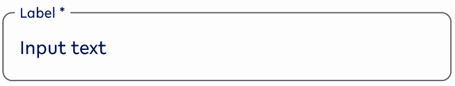
Default states
Default
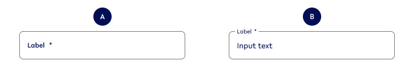
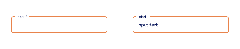
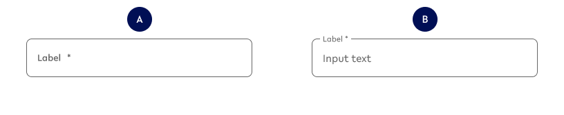
Variant A
text-value
Variant B
text-value
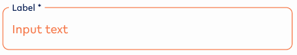
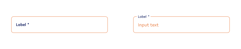
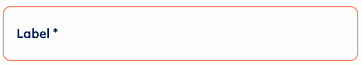
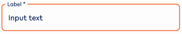
Error
Variant A - No Value
text-noValue-error
Variant B - Value
text-value-error
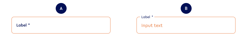
Hover state (Desktop Only)
Default
Variant A - No Value
text-noValue-hover
Variant B - Value
text-value-hover
Error

Variant A - No Value
text-noValue-hover-error
Variant B - Value
text-value-hover-error
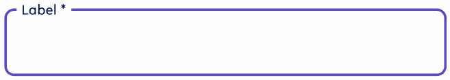
Focused state
Default
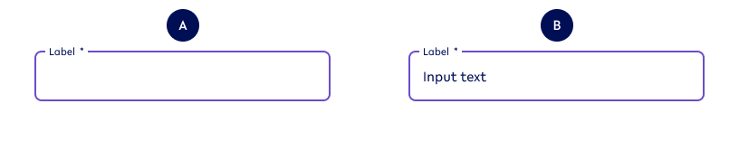
Variant A - No Value
text-noValue-focused
Variant B - Value
text-value-focused
Error
Variant A - No value
text-noValue-focused-error
Variant B - Value
text-value-focused-error
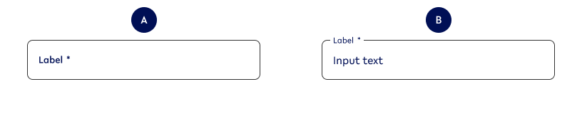
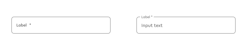
Inactive state
Variant A - No value
text-noValue-inactive
Variant B - Value
text-value-inactive
Options for ALL input field types
Option A - Input field size
|
Example - Small |
Example - Default |
|---|---|
textS-noValue |
text-noValue |
|
Use when
|
Use when
|
|
Don’t use when
|
Don’t use when
|
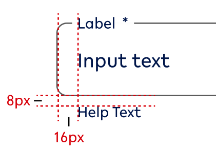
Specifications
This smaller size of the textfield input functions the same way a default size would. The only difference is their height:
-
40px
Possible combinations
This option can be combined with all other options EXCEPT:
-
Multi-line (auto)
-
Multi-line (manual)
Finding the variation in Figma
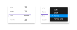
You can choose between the following different sizes:
-
Normal/ Default
-
Small
-
Normal-auto (height changes to input)
-
Multi (height is set manually, but above default)
Option B - Input value (mapped out above)
|
Example - NO |
Example - YES |
|---|---|
|
text-noValue |
text-value |
|
Use when
|
Use when
|
|
Don’t use
|
Don’t use when
|
Possible combinations
This option can be combined with all other options.
Finding the variation in Figma
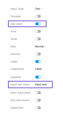
When there is no input text available, the toggle is switched off and the input text value cannot be manipulated.
When it is switched on (see left side), you can amend the text that is shown as input text value.
Playground in Figma here: https://www.figma.com/file/F1fNT99VGTJHJ1jAnjFTn6/Youtap-Style-guide-V1.0.2023?node-id=1361%3A69988&t=I5aV1wewlsQHD3gp-1
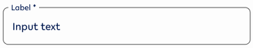
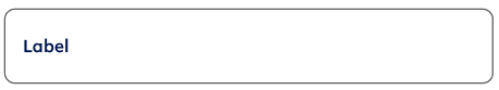
Option C - Label
|
Example - NO |
Example - YES |
|---|---|
text-noValue-nolabel |
text-noValue |
|
Use
|
Use when
|
|
Don’t use
|
Don’t use when
|
Possible combinations
This option can be combined with all other options
Finding the variation in Figma
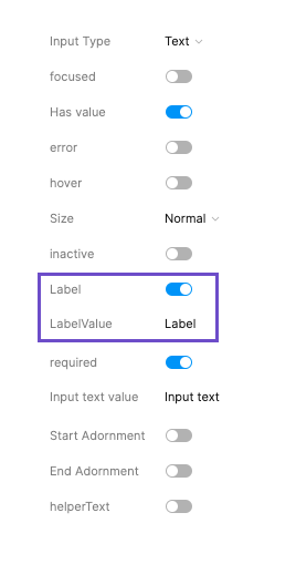
When there is no label available (DO NOT USE), the toggle is switched off and the label value cannot be manipulated.
When it is switched on (see left side), you can amend the text that is shown as label value.
Playground in Figma here: https://www.figma.com/file/F1fNT99VGTJHJ1jAnjFTn6/Youtap-Style-guide-V1.0.2023?node-id=1361%3A69988&t=I5aV1wewlsQHD3gp-1
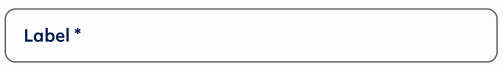
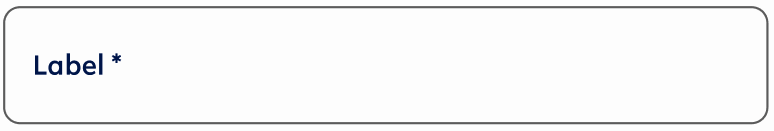
Option D - Mandatory/Required fields
|
Example - NO |
Example - YES |
|---|---|
text-noValue-noReq |
text-noValue |
|
Use when
|
Use when
|
|
Don’t use when
|
Don’t use when
|
Specifications
The mandatory/ required state is indicated by an asterisk (*) at the end of the label.
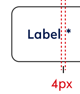
Text style - style of the related label (for this instance: label1)
Text colour - style of the related label (for this instance: primary)
Possible combinations
This option can be combined with all other options
Finding the variation in Figma
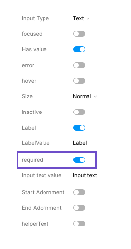
When the field is not required, the toggle is switched off and removes the mandatory indicator (*).
When it is switched on (see left side), you add a mandatory indicator (*) to the label.
Playground in Figma here: https://www.figma.com/file/F1fNT99VGTJHJ1jAnjFTn6/Youtap-Style-guide-V1.0.2023?node-id=1361%3A69988&t=I5aV1wewlsQHD3gp-1
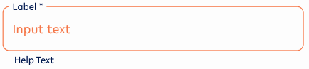
Option E - Error state
|
Example - NO |
Example - YES |
|---|---|
text-Value |
text-Value-error |
|
Use when
|
Use when
|
|
Don’t use when
|
Don’t use when
|
Possible combinations
This option can be combined with all other options.
Finding the variation in Figma
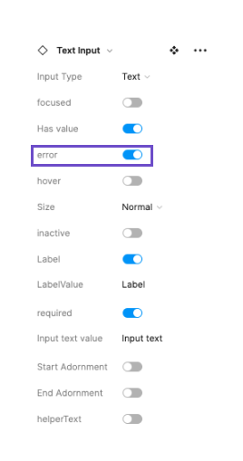
When the field has no error, the toggle is switched off.
When it is switched on (see left side), the field moves into error state.
Playground in Figma here: https://www.figma.com/file/F1fNT99VGTJHJ1jAnjFTn6/Youtap-Style-guide-V1.0.2023?node-id=1361%3A69988&t=I5aV1wewlsQHD3gp-1
Option F - Start Adornment (sA)
|
Example - NO |
Example - YES |
|---|---|
|
text-noValue |
text-noValue-sA |
|
Use when
|
Use when
|
|
Don’t use when
|
Don’t use when
|
Specifications for Start Adornment
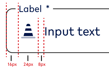
Icon size - 24x24px
Colour - needs to be set in the primary colour scheme
Possible combinations
This option can be combined with all other options
Be careful in combining Start and End Adornment (option G + option F) and ONLY use them in exceptional cases like:
-
Search field (magnifying glass + close as icons at front and end)
Finding the variation in Figma
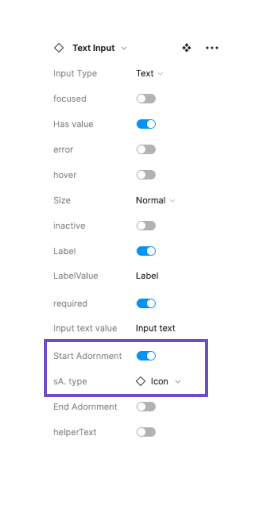
When the field is not required, the toggle is switched off and removes the icon that would sit at the front of the textfield. This is the default state.
When it is switched on (see left side), you can select the icon that corresponds with what content is needed in this field.
Playground in Figma here: https://www.figma.com/file/F1fNT99VGTJHJ1jAnjFTn6/Youtap-Style-guide-V1.0.2023?node-id=1361%3A69988&t=I5aV1wewlsQHD3gp-1
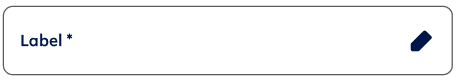
Option G - End Adornment (eA)
|
Example - NO |
Example - YES |
|---|---|
|
text-noValue |
text-noValue-eA |
|
Use when
|
Use when
|
|
|
Don’t use when
|
Specifications for End Adornment
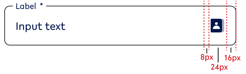
Icon size - 24x24px
Colour - needs to be set in the primary colour scheme
Possible combinations
This option can be combined with all other options
Be careful in combining Start and End Adornment (option F + option G) and ONLY use them in exceptional cases like:
-
Search field (magnifying glass + close as icons at front and end)
Finding the variation in Figma
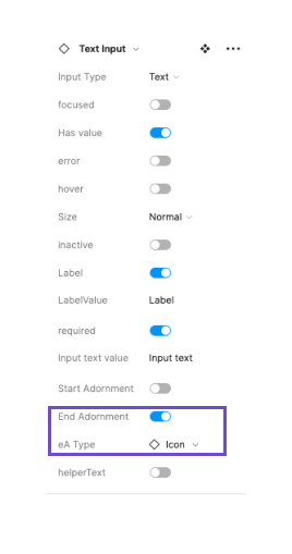
When the field is not required, the toggle is switched off and removes the icon that would sit at the end of the textfield. This is the default state.
When it is switched on (see left side), you can select the icon that corresponds with what content is needed in this field.
Playground in Figma here: https://www.figma.com/file/F1fNT99VGTJHJ1jAnjFTn6/Youtap-Style-guide-V1.0.2023?node-id=1361%3A69988&t=I5aV1wewlsQHD3gp-1
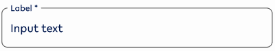
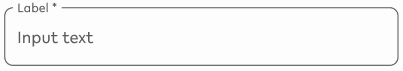
Option H - Help text
|
Example - NO |
Example - YES |
Example - YES-ERROR |
|---|---|---|
|
text-noValue |
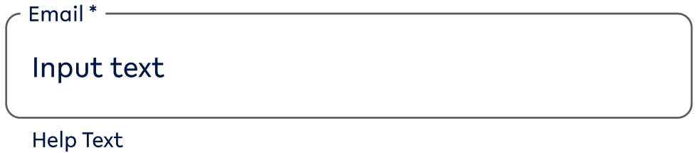
text-value-help |
text-Value-help-error |
|
Use when
|
Use when
|
Use when
|
|
Don’t use when
|
Don’t use when
|
Don’t use when
|
Specifications
Possible combinations
This option can be combined with all other options.
Finding the variation in Figma
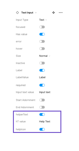
When the help text is not required, the toggle is switched off and removes the option of adding an icon and a value to the help text area.
When it is switched on (see left side), you can select the icon that corresponds with the help text and set the value of the help text.
Playground in Figma here: https://www.figma.com/file/F1fNT99VGTJHJ1jAnjFTn6/Youtap-Style-guide-V1.0.2023?node-id=1361%3A69988&t=I5aV1wewlsQHD3gp-1
Option I - Active/ Inactive
|
Example - active |
Example - inactive |
|---|---|
text-value - active |
text-value-inactive |
|
Use when
|
Use when
|
|
Don’t use when
|
Don’t use when
|
Possible combinations
This option can be combined with the ALL options EXCEPT:
-
Option E - Error state
Finding the variation in Figma
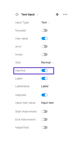
When the text cannot be edited, the toggle should be switched on. The default should be switched off.
Playground in Figma here: https://www.figma.com/file/F1fNT99VGTJHJ1jAnjFTn6/Youtap-Style-guide-V1.0.2023?node-id=1361%3A69988&t=I5aV1wewlsQHD3gp-1
02. Usage and application
Standard states - Application
Default state
Default
|
Use when |
Don’t use when |
|---|---|
|
|
Error

|
Use when |
Don’t use when |
|---|---|
|
|
Hover state (Desktop ONLY)
Default

|
Use when |
Don’t use |
|---|---|
|
|
Error
|
Use when |
Don’t use when |
|---|---|
|
|
Focused state
Default

|
Use when |
Don’t use when |
|---|---|
|
|
Error
|
Use when |
Don’t use when |
|---|---|
|
|
Inactive state
|
Use when |
Don’t use when |
|---|---|
|
|
03. Interaction behaviour
Default interaction
Whenever there is a form the textfields follow the following order of states:
|
Input field variant |
Visual reference |
User behaviour |
|---|---|---|
|
Default behaviour |
||
|
Default Var A → |
|
User has not yet selected the input field and there is no input yet. |
|
→ Focused Var A → |
|
User selects current input field and starts entering the required value of the field. |
|
→ Default Var B |
|
User has finished their input and moved on to another input field. |
|
ERROR IS TRIGGERED |
||
|
Error Var A |
|
User has not yet given input to a required field, but has pressed a CTA to move forward OR started entering value for the next input field. (this usually includes a helptext) |
|
Error Var B |
|
User has added value to the input field, however, it does not match the input. (This usually includes a helptext) |
|
Error Var B |
|
User has clicked on the field that fired an error and starts changing the value. |
|
HELP TEXT GETS DISPLAYED |
||
|
Error Help Text |
|
User has entered the wrong input and gets an error message. |
First editable input field on a page
This input field is automatically set to Focused Var A.
In-line validation
To check if an input has been made and made correctly, we are using in-line validation.
In-line validation
This should always happen AFTER a customer has entered information. Also, they should have moved to the next textfield, i.e. the state of the textfield changes from focused to default. (see prototype here)
Exception:
-
Password validation (see below)
Password validation
For validating the password, we are using the following approach:
-
User enters textfield brings up the different requirements for the password setup.
-
With entering the password, the requirements are constantly checked and ticked off until all of them are ticked off.
04. Accessibility
For textfields, follow the WCAG2.0 - AA standard for colour, readability and other relevant considerations for textfields.
Figma plugins to check AA accessibility
Best for designing or exploring
A11y - https://www.figma.com/community/plugin/733159460536249875
Best for final check
contrast - https://www.figma.com/community/plugin/911262488575486588
05. Resources
|
Resource |
Link |
Notes |
|---|---|---|
|
Figma file |
further includes multi-line inputs |
|
|
WCAG2.0 - Checklist |
https://www.w3.org/TR/2006/WD-WCAG20-20060427/appendixB.html |
|
|
Figma Textfield Interaction Prototype |
Clickable between different states of the textfield |
|
|
Contrast checker |
Design/Exploration https://www.figma.com/community/plugin/733159460536249875 Final check |
|