Foundations inform the basis of any great user interface, from accessibility standards to essential patterns for layout and interaction.

Why Foundations?
To keep a user interface consistent across every component, even when new ones are designed, foundations are the key to keeping that consistency. This help the customer to find their way around the app and sets expectations on where to find elements and how to use the app.
What to know before digging in deep?
To use the design styleguide correctly, please pay attention to the following:
All designs are optimised for a screen size of
375 x 812px (iPhone 13 mini)
Certain elements are customisable, however, this will be kept to a minimum. Elements that are customisable are highlighted in the guide.
What’s included?

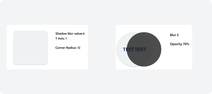
Standards for shadows, blurs, and corner radius