
Introduction
The purpose of a toggle UI is to allow users to quickly and easily change the state of a setting or option. Toggle UIs are typically used for settings that have two mutually exclusive states, such as "on" and "off”.
Figma component - Toggle Scan
All the variations of a page header are the following:
01. Usage & Specifications
01. Toggle
Use this toggle
-
as an on/off switch for list elements
-
It is used for
-
Profile settings
-
Biometric login
-
Notification settings
-
Card management, e.g. freezing a card
-
toggle-off

toggle-on

02. Switch
Use this toggle
-
as a switch between 2 different pages
-
It is used for
-
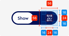
Scan/ Show QR code
-
Specifications
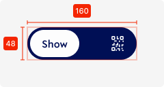
height - 48px
width - 160px (depending on text length)
background colour - primary
corner radius - 48px
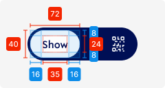
Selected element
height - 40px
width - 72px (depending on text length)
background colour - tertiary-white
corner radius - 48px
padding left/right - SP_2
padding top/bottom - SP_1
02. Interaction behaviour
01. Toggle
Moving the toggle right changes the state of the toggle from OFF to ON
The opposite direction changes the state from ON to OFF
02. Switch
Moving the switch right changes the state of the toggle from Option 1 to Option 2.
The opposite direction changes the state from Option 2 to Option 1.
Here the whole content of the screen changes depending on what is currently selected.
03. Accessibility
The standard for accessibility should always be WCAG2.0 - AA compliance for colour contrast and readability of the text.
04. Customisation options for Products
|
Item |
Option A - Whitelabel |
Option B - Restricted custom |
Option C - Fully custom |
|---|---|---|---|
|
Label (text) |
✅ |
✅ |
✅ |
|
Colour palette (fitting the Youtap palette) |
✅ |
✅ |
✅ |
|
Font |
✅ |
✅ |
✅ |
|
Iconography |
❌ |
✅ |
✅ |
|
Typography |
❌ |
❌ |
✅ |
|
Spacing/ Padding |
❌ |
❌ |
✅ |
05. Resources
|
Type |
Link |
Notes |
|---|---|---|
|
Figma file |
|
|
|
WCAG2.0 Checklist |
https://www.w3.org/TR/2006/WD-WCAG20-20060427/appendixB.html |
|