
Introduction Work in progress
Typography in design system to make written language legible, readable, and appealing when displayed. It involves selecting typefaces, point sizes, line lengths, line-spacing, and letter-spacing, and adjusting the space between pairs of letters. Effective typography can help establish a visual hierarchy, convey the tone and personality of the brand, and enhance the overall user experience.
This section includes the following:
Font family customisable
The following font family is used for YouTap only and can be adapted necessary to the client’s requirement:
R-Flex
Font family within Resources section
Specifications Finalised Not customisable
REM values still need to be confirmed!
|
|
Weight
|
Size
|
REM value |
Line spacing
|
Kerning
|
|---|---|---|---|---|---|

|
Medium 500 weight |
30pt |
1.75 |
40 |
0 |

|
Regular 400 weight |
30pt |
1.75 |
40 |
0 |

|
Medium 500 weight |
24pt |
1.5 |
36 |
0 |

|
Medium 500 weight |
18pt |
1.25 |
24 |
0 |

|
Medium 500 weight |
16pt |
1 |
24 |
0 |

|
Regular 400 weight |
16pt |
1 |
22 |
0 |

|
Regular 400 weight |
14pt |
0.8 |
20 |
0 |

|
Medium 500 weight |
12pt |
0.75 |
18 |
0 |

|
Medium 500 weight |
14pt |
0.8 |
21 |
0 |

|
Regular 400 weight |
12pt |
0.75 |
16 |
0 |
Application and Usage
Main information about the page, highlighting the content. Used with large empty area - Page Heading
-
Success/Pending
-
Page Heading
Account balance for Transfer funds
Small Account UI balance
Account detail sub heading
-
Transaction detail Top UI details
-
Navigation headings
-
Filter related headings
-
Menus
-
Login page instruction sub heading
-
CTA buttons
-
Intro screens body texts
-
KYC intro instruction body
-
Descriptions body texts
-
List UI text body e.g. Open saving account.
-
Notification body text
-
Transaction detail
Transaction date divider (transaction history page)
Minor labelling and supporting texts
-
Account name ( transaction History state )
-
Transaction history transaction type & Date
Customisation
CUSTOMISABLE
-
Font type family is customisable
-
Client is to provide all font family material from Light to Black weights.
-
NON-CUSTOMISABLE
-
Font weight
-
Size
-
Kerning
Sample of Screen + Components to test
https://www.figma.com/file/F1fNT99VGTJHJ1jAnjFTn6/Youtap-Style-guide-V1.0.2023?node-id=693%3A63543&t=UajFS9CdEBXH3S10-1
Accessibility
Different font family comparison for accessibility → https://www.figma.com/file/F1fNT99VGTJHJ1jAnjFTn6/Youtap-Style-guide-V1.0.2023?node-id=905%3A67637&t=aBayz8I0BAb05eFa-1
The choice has been made based on following factors:
-
Legibility:
-
Easy readability
-
versatile in terms of balanced thickness increments
-
Any overlap between text: line spacing is 1.3 → 1.5 times depending on the typography to make sure there is plenty of spacing
THIS IS TO VARY DEPENDING ON THE FONT FAMILY CHOSEN FOR RESKIN PROCESS*
-
-
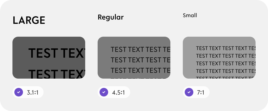
Contrast
(WCAG) 2.1 provide guidelines on minimum contrast ratios.
The minimum contrast ratio depends on the size of the text of "normal" or "large" text.-
For "large" text (18pt or larger or 14pt bold or larger):
-
Minimum contrast ratio is 3:1
-
-
For "normal" text (less than 18pt or 14pt bold):
-
Minimum contrast ratio is 4.5:1
-
The luminance (brightness) difference between text and background should be at least 4.5 times greater for text to be considered accessible
-
-
For “small' text (less than 14pt):
-
Minimum contrast ratio of
-
-
-
Boldness/thickness subject to change Customisable
-
Currently used thickness variation are as following:
-
Regular 300
-
Medium 400
-
-
Reasons to avoid using all line thicknesses in typography for a style guide in app design include:
-
Visual Hierarchy: Varying line thicknesses can emphasize important information.
-
Consistency: A limited set of line thicknesses creates a cohesive design system.
-
Clutter: Too many line thicknesses can make the design overwhelming.
-
Brand Identity: Specific line thicknesses may align with the app's brand identity.
[ However, when reskinning, client is to provide all of font family variations, thin, regular, medium, semi-bold, bold and Black]
Code snippets To do
TBC
Resources Wip
|
|
Link |
Notes |
|---|---|---|
|
Figma file |
https://www.figma.com/file/F1fNT99VGTJHJ1jAnjFTn6/Youtap-Style-guide-V1.0.2023?node-id=71%3A12175&t=UajFS9CdEBXH3S10-1 |
WIP |
|
Font family |
|
|