
Components describe the building blocks of the app and are used to keep the look & feel consistent for the user. It further increases efficiency as already created components can be reused and are easier to build than creating new ones.

What can I expect to find?
For each component, we are covering the following:
-
Specifications
-
Default
-
Variations
-
-
Application and Usage (do’s & don’t's)
-
Customisation options (for client adaptation)
-
Visual examples
-
Accessibility considerations
-
Version history
-
Code snippets
Before creating a new component, always check if you can reuse an existing component for a new functionality rather than creating a new one.
What’s included? TO BE UPDATED

Transactions

--
Notes
Introduction overview:
...
Specs: Details of the UI value
-
Visual of the component
-
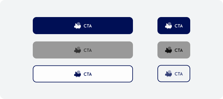
Different states
-
Anatomy of the component
-
Label of base components used
-
Label of colour scheme used
-
-
Spacing and padding refinement visual representation
-
Do & Don’t
-
Different states
...
Application and usage
-
Table format defining standard application for each of colours
-
Figma links/thumbnails for example of the screens
...
Customisation
-
Define customisable element
-
Maximum copy content
...
Code Snips ( linked form the tables above )
Accessibility