
Developer inquiry:
-
Can these be customisable as a one-stop change in similar fashion to the colours.
Introduction of the area Work in progress
Within this area you can find elements and design specifications that are universal throughout the app and cannot be changed.
These need to be implemented throughout the app where they appear and would need be changed at a global level.
The following is a table of the elements included on this page:
Relevant Figma
https://www.figma.com/file/F1fNT99VGTJHJ1jAnjFTn6/Youtap-Style-guide-V1.0.2023?node-id=276%3A47713&t=9iJWk1QINAQaSjYK-1
01. Shadow NON-Customisable
|
Last updated |
06.04.2023 |
|
Author |
@Unknown user |
|
Discarded version link |
NA |
A shadow is a darkened outline of an element to make it stand out from the screen.
It is mainly used for:
-
Cards
-
Icon outlines
-
Overlaying UI elements
Specifications
|
Label |
Visual |
Shadow Blur Value |
Y-Axis value |
|---|---|---|---|
|
shadow-y1 |
|
4 |
1
|
|
shadow-y4 |
|
4 |
4 |
Application and Usage
When to use shadow-y1
When to use shadow-y1
When to use shadow-y4
When NOT to use shadow-y1
When NOT to use shadow-y4
Customisation options
NOT CUSTOMISABLE
This is a static area and needs to be followed for all shadows used across the app.
Code snippets
Link to code library
Accessibility
TBD
02. Corner Radius NON-Customisable
|
Last updated |
06.04.2023 |
|
Author |
@Unknown user |
|
Discarded version link |
NA |
For every overlay or card that has a corner, the corner radius defines how straight or round the corners have to be to keep a consistent visual appearance.
Specifications
|
Label |
Visual |
Corner Radius |
|---|---|---|
|
corner-radius |
|
12px |
|
corner-radius-40 |
|
40px |
Application and Usage
corner-radius is used in all instances where a corner is involved. These cases are the following, but not limited to them:
-
Cards
-
Tiles
-
Overlays (pop-ups, dialogues, etc.) - radius 40px
-
Buttons etc.
Do NOT use corner-radius for:
-
the screens themselves
-
Icons
Customisation options
NOT CUSTOMISABLE
This is a static area and needs to be followed for all shadows used across the app.
Code snippets
Link to code library
Accessibility
TBD
03. Blur NON-Customisable
|
Last updated |
06.04.2023 |
|
Author |
@Unknown user |
|
Discarded version link |
NA |
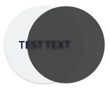
A blur is used to darken out the background for an overlay. This is usually to keep the emphasis on the actual overlay content.
Specifications
|
Label |
Visual |
Blur value |
Opacity % |
|---|---|---|---|
|
blur |
|
5 |
70 |
Application and Usage
A blur is used to
-
Darken out the background for an overlay
-
Keep emphasis on the main overlay shown
Do NOT use blur for:
-
Icons
-
Active cards etc.
Customisation options
NOT CUSTOMISABLE
This is a static area and needs to be followed for all shadows used across the app.
Code snippets
Link to code library
Accessibility
TBD
03. Stroke outline NON-Customisable
To do
NOTES
-
Introduction overview:
-
Specs: Details of the UI value
-
Value
-
-
Application and usage
-
Figma links/thumbnails
-
-
Customisation
-
Do not support customisation to clients and be fixed condition.
-
Can it be one-stop global change
-
-
Code snips
-
Accessibility