
Introduction
The header is typically the topmost element of a design, whether it's a website, document, presentation, or any other medium. Its primary purpose is to provide essential information about the content or identity of the design. It is often used to display the title or name of the document, website, or section, allowing users or viewers to quickly grasp the overall context. Headers are essential for branding, navigation, and providing a consistent visual identity throughout the design.
Figma component - Top Nav | Section header
All the variations of a page header are the following:
01. Usage & Specifications
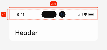
Variant A - Default
Use this variant for the following scenarios:
-
There is no page to go back to AND
-
No shortcut action needed
header-page-default
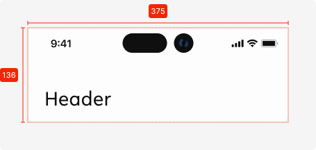

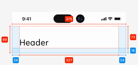
Specifications
Length - 327px (full screen width)
Height - 136px
Text colour - tertiary-black
Text alignment - left-aligned
Text limit - 1 line
Text limit - heading2
Corner radius bottom - see
Interaction dependent:
shadow -
Used components
Status bar - Native elements
Variant B - Back navigation
Use this variant for the following scenarios:
-
There is a page to go ‘Back’
-
No shortcut action needed
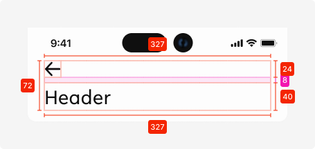
Additional specifications
Spacing - SP_1
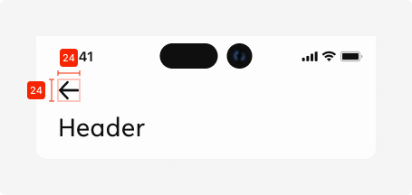
Icon size (static)
24px * 24px
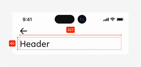
Text field size
Length - 327px
Height - 40px
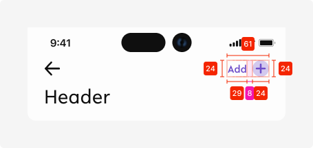
Variant C - Back navigation + Icon
Use this variant for the following scenarios:
-
There is a page to go ‘Back’ to AND
-
Extra action needs to be easily accessible
Variant C - Back navigation + Text + Icon
Use this variant for the following scenarios:
-
There is a page to go ‘Back’ to AND
-
Extra action needs to be easily accessible AND
-
Description for the action is needed to convey meaning of shown icon
02. Interaction behaviour
01. Landing on page
When the user lands on a page with a header, it is displayed in the default state.

02. Scrolling down
Once the user scrolls down and content moves behind the header element, the header element gets a shadow to indicate that there is more content moved to the top of the screen.

Shadow specs -
This state is kept until there is no content behind the header element.

03. Scrolling back up
When a user scrolls back up and all content is visible from the top (no content behind the header element), the shadow disappears and the header returns to its default state.
03. Accessibility
The standard for accessibility should always be WCAG2.0 - AA compliance for colour contrast and readability of the text.
04. Customisation options for Products
|
Item |
Option A - Whitelabel |
Option B - Restricted custom |
Option C - Fully custom |
|---|---|---|---|
|
Label |
✅ |
✅ |
✅ |
|
Iconography |
❌ |
✅ |
✅ |
|
Typography |
❌ |
❌ |
✅ |
|
Spacing/ Padding |
❌ |
❌ |
✅ |
05. Resources
|
Type |
Link |
Notes |
|---|---|---|
|
Figma file |
|
|
|
WCAG2.0 Checklist |
https://www.w3.org/TR/2006/WD-WCAG20-20060427/appendixB.html |
|