
Introduction
Chat Elements are a fundamental component of our app's user interface, designed to facilitate seamless communication and support interactions. These elements encompass everything from message bubbles and input fields to user avatars and timestamps. They play a pivotal role in shaping the user's experience, allowing them to exchange messages, seek assistance, and engage with the app's content effortlessly. With a focus on clarity, consistency, and user-friendliness, our Chat Elements ensure that users can navigate conversations with ease, making our app a reliable platform for meaningful interactions.
This chapter includes the following
01. Components
01. Chat bubbles
Figma element - Chatbot Elements
Usage & Specifications
This component is used in the following scenarios:
-
For customer support
-
For messages between the system/customer support and the user
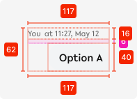
chat-bubble-received

chat-bubble-sent
Specifications
width - 258px
height - text dependent
space between elements - 6px
02. Chat box
Figma element - Interactive chatbox
01. Usage & Specifications
This component is used in the following scenarios:
-
For customer support
-
For messages between the system/customer support and the user
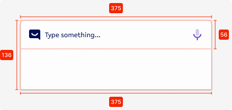
chatbox
Specifications
width - 375px (full screen width)
height - 136px (expands with amount of text entered)
background - tertiary-white
corner-radius top - 8px
bottom padding - 80px
02. Interaction behaviour
02. Customisation options for Products
|
Item |
Option A - Whitelabel |
Option B - Restricted custom |
Option C - Fully custom |
|---|---|---|---|
|
Label (text) |
✅ |
✅ |
✅ |
|
Colour palette (fitting the Youtap palette) |
✅ |
✅ |
✅ |
|
Font |
✅ |
✅ |
✅ |
|
Iconography |
❌ |
✅ |
✅ |
|
Typography |
❌ |
❌ |
✅ |
|
Spacing/ Padding |
❌ |
❌ |
✅ |
03. Accessibility
For indicative UI, follow the WCAG2.0 - AA standard for colour, readability and other relevant considerations for indicative UI elements.
Figma plugins to check AA accessibility
Best for designing or exploring
A11y - https://www.figma.com/community/plugin/733159460536249875
Best for final check
contrast - https://www.figma.com/community/plugin/911262488575486588
04. Resources
|
Resource |
Link |
Notes |
|---|---|---|
|
Figma file |
|
|
|
WCAG2.0 - Checklist |
https://www.w3.org/TR/2006/WD-WCAG20-20060427/appendixB.html |
|
|
Contrast checker |
Design/Exploration https://www.figma.com/community/plugin/733159460536249875 Final check |
|