
Note
Only use preset selection fields when you are sure that all options can be covered with the options presented in the dropdown.
Use a text input otherwise.
Introduction
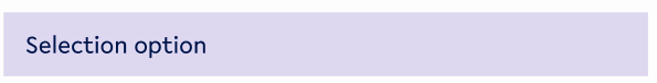
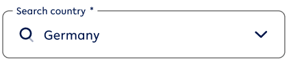
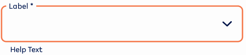
Selection fields provide the user with a preset list to choose from. It makes it easier for them to find the right option for the field required as it limits the answers a user can choose from.
Figma component - Selection field
This section includes the following:
01. Specifications
Default states
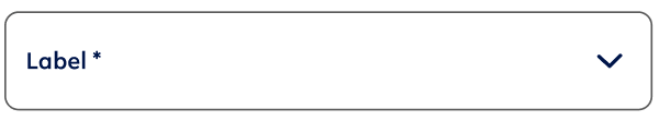
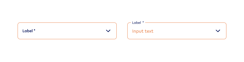
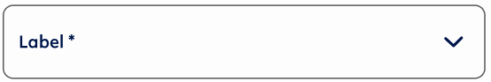
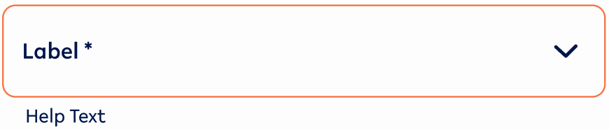
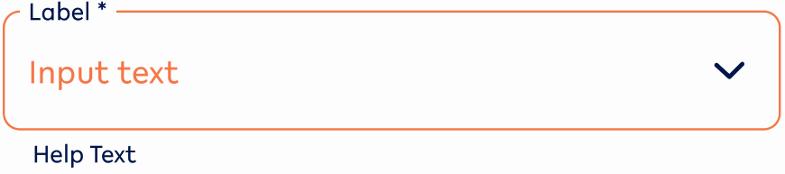
Default
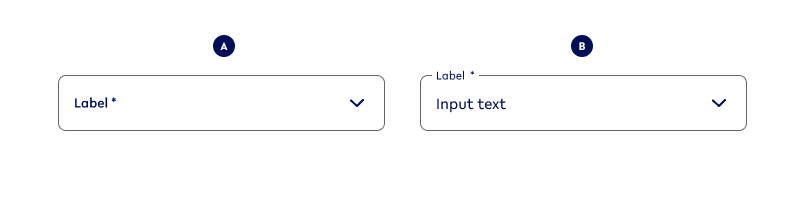
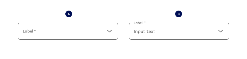
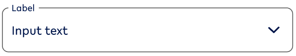
Variant A - No Value
select-noValue
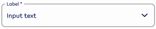
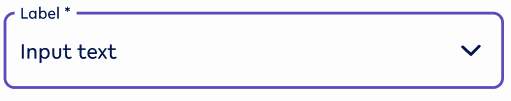
Variant B - Value
select-value
Error
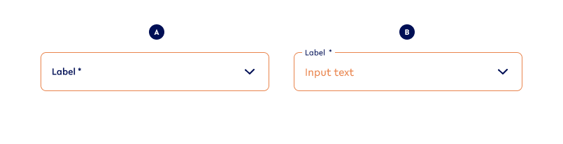
Variant A - No Value
select-noValue-error
Variant B - Value
select-value-error
Hover states (Desktop ONLY)
Default
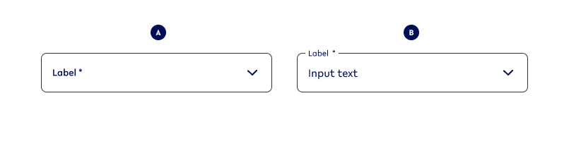
Variant A - No Value
select-noValue-hover
Variant B - Value
select-value-hover
Error

Variant A - No Value
select-noValue-hover-error
Variant B - Value
select-value-hover-error
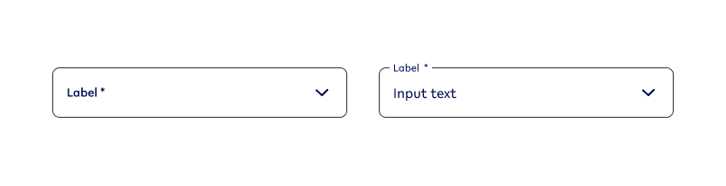
Focused states
Default
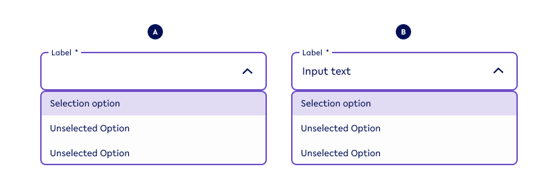
Variant A - No Value
select-noValue-focused
Variant B - Value
select-value-focused
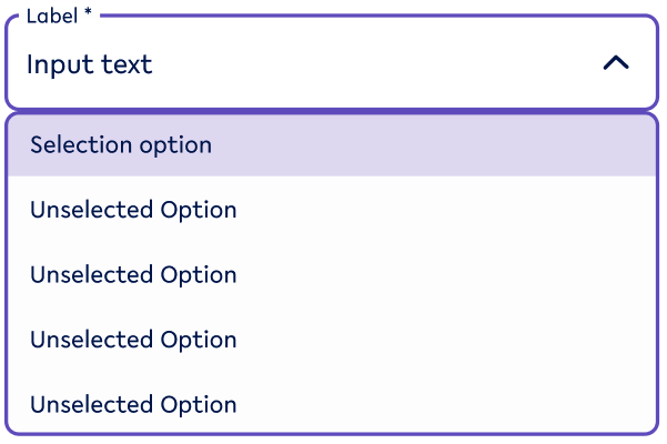
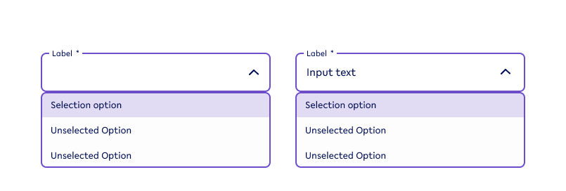
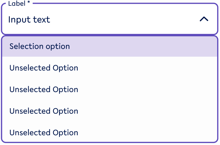
List selection for open selection (Focused state)
|
Selected list item |
Unselected list item |
|---|---|
list-selected |

list-unselected |
|
Specifications 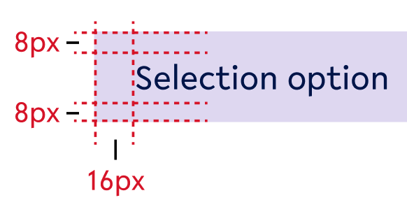
|
|
|
background - secondary2-20 text-colour - primary text-size - body2 |
background - tertiary-white text-colour - primary text-size - body2 |
|
Use when
|
Use when
|
|
Don’t use when
|
Don’t use when
|
Error

Variant A - No Value
select-noValue-focused-error
Variant B - Value
select-value-focused-error
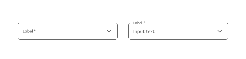
Inactive states
Variant A - No Value
select-noValue-inactive
Variant B - Value
select-value-inactive
Options for ALL Selection fields
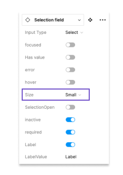
Option A - Selection field size
|
Example - Small |
Example - Default |
|---|---|
selectS-value |
select-value |
|
Use when
|
Use when
|
|
Don’t use when
|
Don’t use when
|
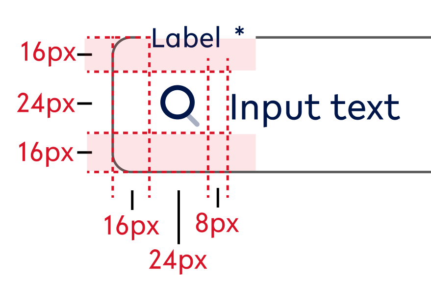
Specifications
This smaller size of the textfield input functions the same way a default size would. The only difference is their height:
-
40px
Possible combinations
This option can be combined with all other options.
How to find variation on Figma
Figma overview
|
The user can choose between the sizes
|
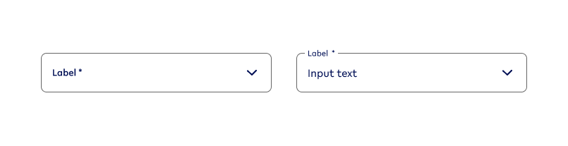
Option B - Input value (mapped out above)
|
Example - NO |
Example - YES |
|---|---|
select-noValue |
select-value |
|
Use when
|
Use when
|
|
Don’t use
|
Don’t use when
|
Possible combinations
This option can be combined with all other options.
How to find variation on Figma
Figma overview
|
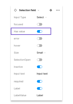
The user can switch between an selection value or not having on when designing the field. The related switch is called ‘Has value’. |
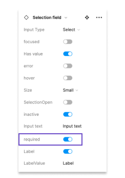
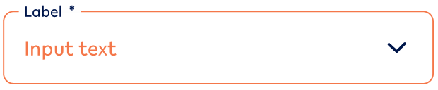
Option C - Mandatory/Required fields
|
Example - NO |
Example - YES |
|---|---|
select-value-noReq |
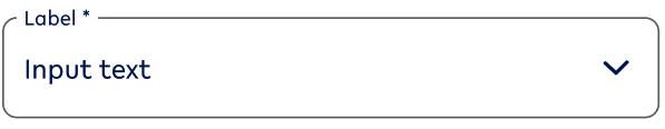
select-value |
|
Use when
|
Use when
|
|
Don’t use when
|
Don’t use when
|
Specifications
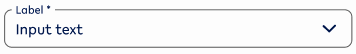
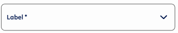
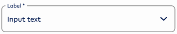
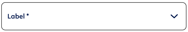
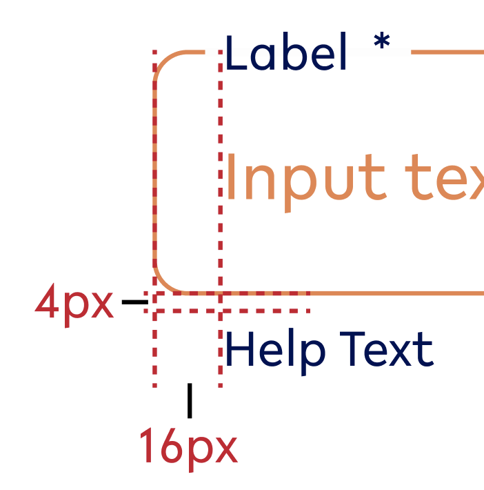
The mandatory/ required state is indicated by an asterisk (*) at the end of the label.
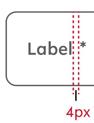
Text style - style of the related label (for this instance: label1)
Text colour - style of the related label (for this instance: primary)
Possible combinations
This option can be combined with all other options
How to find variation on Figma
Figma overview
|
When a textfield is mandatory or required, the user can switch it on and off in the designs in Figma. The related switch is called ‘required’. |
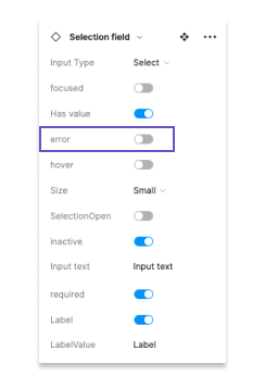
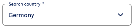
Option D - Error state
|
Example - NO |
Example - YES |
|---|---|
|
select-value |
select-value-error |
|
Use when
|
Use when
|
|
Don’t use when
|
Don’t use when
|
Possible combinations
This option can be combined with all other options.
How to find variation on Figma
Figma overview
|
When the textfield fires an error (in case it is mandatory and does not fit the necessary criteria), the Figma user changes the state to ‘error’ on. The related field is ‘error’. The default state is off. |
Option E - Start Adornment (sA)
|
Example - NO |
Example - YES |
|---|---|
select-value |
select-value-error |
|
Use when
|
Use when
|
|
Don’t use when
|
Don’t use when
|
Specifications
Possible combinations
This option can be combined with all other options, however, be considerate when to use it as it adds additional information to the screen and could overwhelm the customer.
How to find variation on Figma
Figma overview
|
|
When the textfield fires an error (in case it is mandatory and does not fit the necessary criteria), the Figma user changes the state to ‘error’ on. The related field is ‘error’. The default state is off. |
Option F - End Adornment (eA)
This is a requirement for the selection field and won’t change across any selection field.
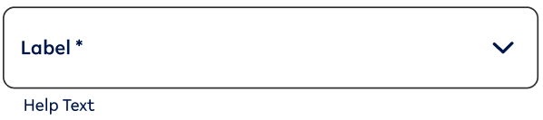
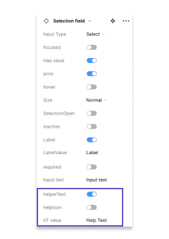
Option G - Help text
|
Example - NO |
Example - YES |
Example - YES-ERROR |
|---|---|---|
select-noValue |
select-noValue-help |
select-noValue-focused-helpError |
|
Use when
|
Use when
|
Use when
|
|
Don’t use when
|
Don’t use when
|
Don’t use when
|
Specifications
Possible combinations
This option can be combined with all other options EXCEPT ‘Option I - open/closed’ for the open selection.
How to find variation on Figma
Figma overview
|
The helper text can be switched on and off for most selection field state. When ‘helperText’ is switched on, a user can
|
Option H - Active/ Inactive
|
Example - active |
Example - inactive |
|---|---|
|
PICTURE TBC text-noValue - active |
PICTURE TBC text-noValue-inactive |
|
Use when
|
Use when
|
|
Don’t use when
|
Don’t use when
|
Possible combinations
This option can be combined with the ALL options EXCEPT:
-
Option D - Error state
How to find variation on Figma
Figma overview
|
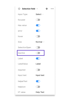
A field can be made inactive, meaning that the user can’t change its input anymore.
The Figma user can switch this state on and off via ‘inactive’. The default state is off. |
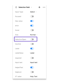
Option I - closed/ open TBD
|
Example - closed |
Example - open |
|---|---|
text-noValue |
text-noValue-focused-open |
|
Use when
|
Use when
|
|
Don’t use when
|
Don’t use when
|
Possible combinations
This option can be combined with the ALL options EXCEPT:
-
Option D - Error state
How to find variation on Figma
Figma overview
|
The user can select from a list of options. With the field ‘SelectionOpen’, the Figma user can decide if the field is shown in an open format or closed. Closed means that the user either hasn’t selected a value or has already selected a value and moved on to another field. The default for this field is closed, except for the focused state. |
02. Usage and application
Standard states
Default States
Default
|
Use when |
Don’t use when |
|---|---|
|
|
Error
|
Use when |
Don’t use when |
|---|---|
|
|
Hover state (Desktop ONLY)
Default
|
Use when |
Don’t use |
|---|---|
|
|
Error

|
Use when |
Don’t use when |
|---|---|
|
|
Focused state
Default

|
Use when |
Don’t use |
|---|---|
|
|
Error
|
Use when |
Don’t use when |
|---|---|
|
|
Inactive state
|
Use when |
Don’t use |
|---|---|
|
|
03. Interaction behaviour
Whenever there is a selection follow the following order of states:
|
Selection field variant |
Visual reference |
User behaviour |
|---|---|---|
|
Default behaviour |
||
|
Default Var A → |
|
User has not yet selected the input field and there is no input yet. |
|
→ Focused open → |
|
User selects current input field and selects a value from the dropdown list underneath. |
|
→ Focused Var B → |
|
User selected a value |
|
→ Default Var B |
|
User moved on to another input field. |
|
ERROR IS TRIGGERED |
||
|
Error Var A |
|
User has not yet given input to a required field, but has pressed a CTA to move forward OR started entering value for the next input field. (this usually includes a helptext) |
|
Error Var B |
|
User has selected something, however, it is the wrong input. (This usually includes a helptext) |
|
Focused state |
|
User has clicked on the selection that fired an error and starts changing the value. |
04. Accessibility
05. Resources
|
Type |
Link |
Notes |
|---|---|---|
|
Figma file |
|
|
|
WCAG2.0 Checklist |
https://www.w3.org/TR/2006/WD-WCAG20-20060427/appendixB.html |
Accessibility |
|
Figma prototype for interaction behaviour |
|
|
|
Colour contrast Figma Plugins |
For Design https://www.figma.com/community/plugin/733159460536249875/A11y---Color-Contrast-Checker For final inspection https://www.figma.com/community/plugin/911262488575486588/Contrast |
|
|
Figma Playground |
|
For developers to try out different selection states |