
Introduction
The purpose of a modal header is to provide a clear and concise title or heading for a specific section or content within a user interface. It helps users quickly identify and understand the information presented in that particular section, enhancing overall navigation and user experience.
This component is only used for Modals and in no other context.
See the structure of a modal in the relevant section here.
Figma component - Modal/Header
All the variations of a modal header are the following:
01. Usage & Specifications
Variant A - Default
Use this variant for the following scenarios:
-
There is no modal to go back to AND
-
No shortcut action needed
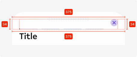
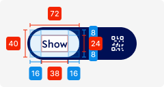
header-modal-default
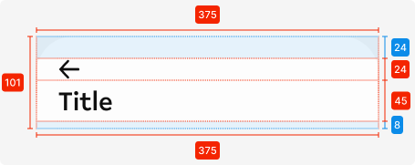

Specifications
Length - 375px (full-screen width)
Height - 101px
padding top - SP_3
padding bottom - SP_1
padding left/right - SP_2
padding between elements - 0px
Text colour - tertiary-black
Text alignment - left-aligned
Text limit - 1 line
Typography - heading1
Corner radius top - see
Icon
size - 24px * 24px
left icon colour - tertiary-black
Interaction dependent:
shadow -
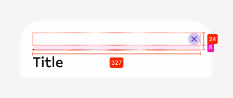
Variant B - Icon only
header-modal-icon

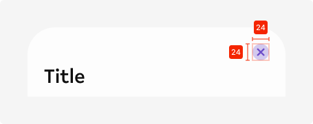
Icon right-aligned
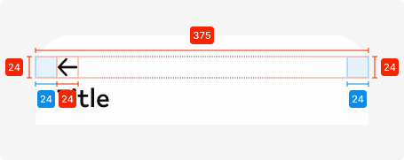
Variant C - Back + Icon
Use this variant for the following scenarios:
header-modal-back+icon
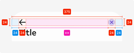
Additional specifications
Spacing between icons - Auto
Variant C - Story
Use this variant for the following scenarios:
header-modal-story
Additional specifications
Component used - Story indicator
Variant D - Toggle
Use this variant for the following scenarios:
header-modal-toggle
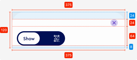

Specifications
Length - 375px (full-screen width)
Height - 120px
padding top - SP_3
padding bottom - SP_1
padding left - SP_2
padding top - SP_3
padding between elements - SP_2
Corner radius top - see
Icon top
size - 24px * 24px
colour - secondary1
Used components
Toggle Scan
Interaction dependent:
shadow -
toggle
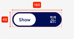
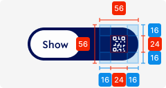
Selected area
length - 56px
height - 56px
Icon
size - 24px * 24px
colour - tertiary-white
padding top/bottom - SP_2
padding left-right - SP_2
02. Interaction behaviour
01. Landing on page
When the user opens up a modal, the modal header will be displayed in the default mode.
02. Scrolling down
Once the user scrolls down and content moves behind the header element, the header element gets a shadow to indicate that there is more content moved to the top of the screen.
Shadow specs -
This state is kept until there is no content behind the header element.
03. Scrolling back up
When a user scrolls back up and all content is visible from the top (no content behind the header element), the shadow disappears and the header returns to its default state.
Toggle behaviour
When the user switches the toggle, the background element moves to the unselected side, switching the icon to a word.
The icon gets pushed out to the side, or is coming in from the side when it becomes unselected.
03. Accessibility
The standard for accessibility should always be WCAG2.0 - AA compliance for colour contrast and readability of the text.
04. Customisation options for Products
|
Item |
Option A - Whitelabel |
Option B - Restricted custom |
Option C - Fully custom |
|---|---|---|---|
|
Label |
✅ |
✅ |
✅ |
|
Iconography |
❌ |
✅ |
✅ |
|
Typography |
❌ |
❌ |
✅ |
|
Spacing/ Padding |
❌ |
❌ |
✅ |
|
Colour |
✅ |
✅ |
✅ |
07. Resources
|
Type |
Link |
Notes |
|---|---|---|
|
Figma file |
|
|
|
WCAG2.0 Checklist |
https://www.w3.org/TR/2006/WD-WCAG20-20060427/appendixB.html |
|