
Introduction
Within this section we talk about the different layout structures, breakpoints etc. that are necessary to create a responsive design across different screen sizes.
Please note
For all mobile devices are designed in 375 x 812px as a standard size.
Please consider this size as the default for scaling up or down.
Breakpoints to follow (width):
Mobile grid - 375px
Tablet grid - 1024px
Desktop grid - 1440px
The following elements will be covered:
Layout Overview
All of these layouts will be based on an 8px grid.
REM in this case refers to 1 rem = 16px.
These need to be reviewed.
|
Layout |
Breakpoint definition (px) |
Nr. of columns (adapts automatically) |
Margin/ Padding |
Gutters (px) |
|---|---|---|---|---|
|
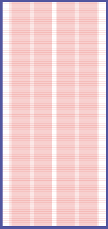
Mobile |
375px |
4 |
24px / 1.5rem |
16px / 1rem |
|
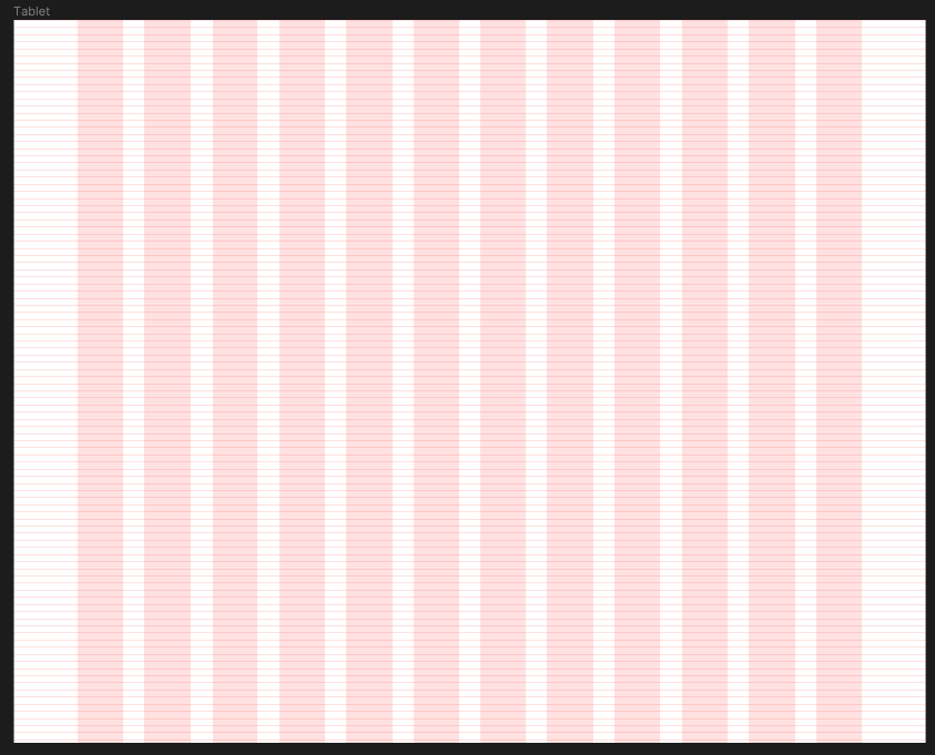
Tablet |
1024px (landscape) |
12 |
72px / 4.5rem |
24px / 1.5rem |
|
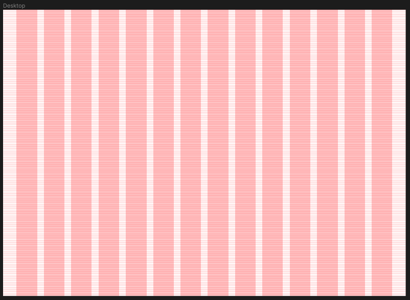
Desktop |
1440px |
14 |
48px / 3rem |
24px / 1.5rem |
Mobile
Tablet
Desktop
Accessibility considerations
Code Snippets (needed?)