
Introduction
Buttons are used to signal the user the next possible action for them and help them get guided through processes and apps.
The following is an overview of the different button types we are using, when to use what style and what is customisable.
All of the button types included on this page are the following:
01. Primary CTA
Different states
Active State
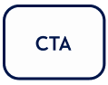
Variant A - Text

button-large-active-A

button-small-active-a
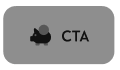
Variant B - Icon + Text

button-large-active-B

button-small-active-B
Variant C - Icon

button-large-active-C

button-small-active-C
Inactive State
Variant A - Text

button-large-inactive-A

button-small-inactive-A
Variant B - Icon + Text

button-large-inactive-B
button-small-inactive-B
Variant C - Icon

button-large-inactive-C

button-small-inactive-C
Usage of Primary CTA
When to use
Overall
The primary CTA is the most important button on a webpage or screen is used to execute the main action. This button should stand out and be easily identifiable by the user.
Avoid using multiple Primary CTAs on one screen. Having more than one main CTA reduces the impact, and makes it harder for users to know what to do next.
Button Size
Use a different size depending on the screen size and the space that is needed. Usually use it when:
-
a primary and a secondary action need to sit next to each other
Inactive State
Use the inactive state when certain requirements are not yet fulfilled by the user and they need these to move forward.
Icon + Text State (Variant B)
Use an additional icon with the text when it adds further information or to make it more playful. However, the icon needs to be clearly related to the action and understood as the same action described by the text. description.
Icon Only State (Variant C)
Use the Variant C - Icon ONLY when the icon is clearly and universally identifiable as an action by the user.
When NOT to use
Do not use a Primary CTA for an action that goes against the goal of the screen, e.g.
-
Cancel
-
‘Sign in’ next to ‘Join now’ (one needs to be primary, the other secondary)
02. Ghost CTA
Different states
Active State
Variant A - Text

button2-large-active-A
button2-small-active-A
Variant B - Icon + Text

button2-large-active-B

button2-small-active-B
Variant C - Icon

button2-large-active-C

button2-small-active-C
Usage of Ghost CTA
When to use
Only use when:
-
there is a primary action already
-
OR the action is secondary to what information needs to be perceived on the screen.
Button Size
Use a different size depending on the screen size and the space that is needed. Usually use it when:
-
a primary and a secondary action need to sit next to each other
Inactive State
Use the inactive state when certain requirements are not yet fulfilled by the user and they need these to move forward.
Icon + Text State (Variant B)
Use an additional icon with the text when it adds further information or to make it more playful. However, the icon needs to be clearly related to the action and understood as the same action described by the text. description.
Icon Only State (Variant C)
Use the Variant C - Icon ONLY when the icon is clearly and universally identifiable as an action by the user.
When NOT to use
Do not use this button when the action needs to be primary or is the goal of the page.
03. Tertiary CTA - Hyperlink
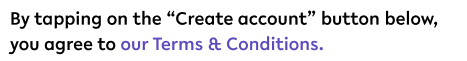
Rules for Hyperlinks
-
Follow same text style as the text the link is embedded in
-
Open up a modal with (usually) a webview of the content it describes
-
text colour - secondary 1
Example
Usage of Hyperlinks
When to use
Only use when:
-
The information it links to is not important for the user to complete a task
-
The information sits outside of the app within a webview
When NOT to use
Do not use this style when the action needs to be primary or is the goal of the page.
Do not use this for actions that N
04. Customisation options
Client can customise the following:
-
Colour scheme, incl. primary and secondary colour
-
Label text
Client cannot customise the following:
-
Size
-
Iconography (ONLY for customised app, not white label)
-
Font (ONLY for customised app, not white label)
05. Accessibility
The standard for accessibility should always be WCAG2.0 - AA compliance for colour contrast and readability of the text.
06. Resources
|
Type |
Link |
Notes |
|---|---|---|
|
Figma file |
|
|
|
WCAG2.0 Checklist |
https://www.w3.org/TR/2006/WD-WCAG20-20060427/appendixB.html |
|