
Introduction
Text input fields are a fundamental element in user interfaces that allow users to input text or data into a digital application or form. Text input fields enable users to provide input for various purposes, such as entering their name, email address, password, or other information, and are commonly used in a wide range of digital interfaces, including websites, mobile apps, desktop applications, and more. Text input fields play a crucial role in user interaction and data collection, as they facilitate communication between users and digital applications.
Figma component - Text input
This section includes the following:
https://www.figma.com/file/F1fNT99VGTJHJ1jAnjFTn6/Youtap-Style-guide-V1.0.2023?node-id=870%3A69165&t=bSOwWTQGqqzPHGGC-1
01. Specifications
Standard States
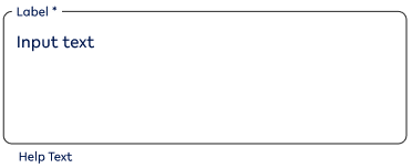
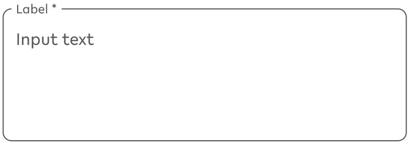
Multi-line input fields should be used when the user has to enter more than one line of input and, therefore, the input needs to stretch across multiple ones.
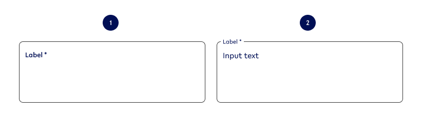
Default State
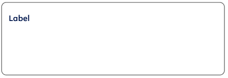
Default

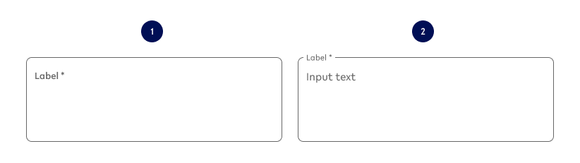
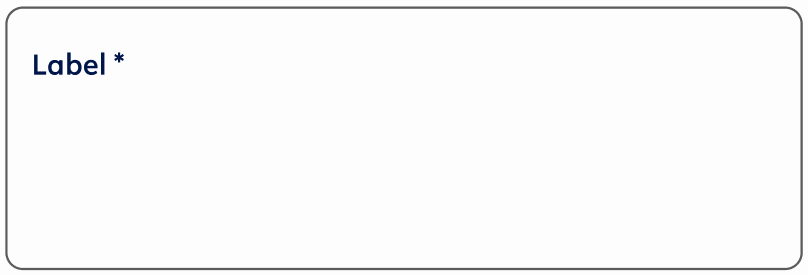
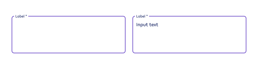
1 - Variant A - No Value
text-multi-noValue
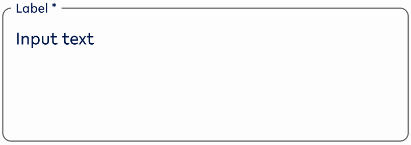
2 - Variant B - Value
text-multi-value
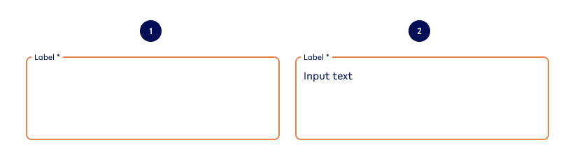
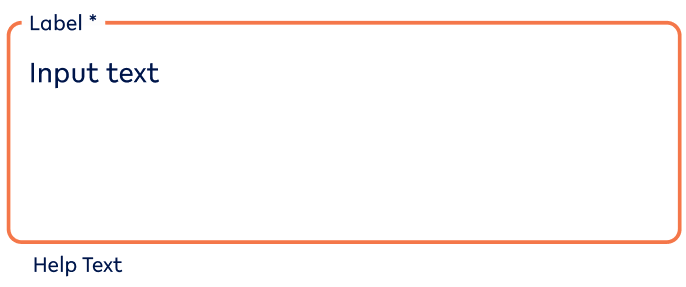
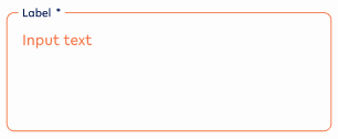
Error

1 - Variant A - No Value
text-multi-noValue-error
2 - Variant B - Value
text-multi-value-error
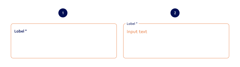
Hover State
Default
1 - Variant A - No Value
text-multi-noValue-hover
text-multi-value-hover
Error
1 - Variant A - No Value
text-multi-noValue-hover-error
2 - Variant B - Value
text-multi-value-hover-error
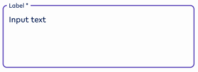
Focused State
Default
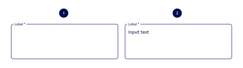
1 - Variant A - No Value
text-multi-noValue-focused
2 - Variant B - Value
text-multi-value-focused
Error
1 - Variant A - No Value
text-multi- noValue-focused-error
2 - Variant B - Value
text-multi-value-focused-error
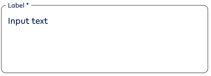
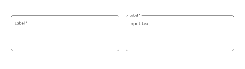
Inactive State
1 - Variant A - No Value
text-multi-noValue-inactive
2 - Variant B - Value
text-multi-value-inactive
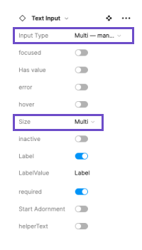
Options for ALL multi-line input field types
Option A - Input value (mapped out above)
|
Example - NO |
Example - YES |
|---|---|
text-multi-noValue |
text-multi-value |
|
Use when
|
Use when
|
|
Don’t use
|
Don’t use when
|
Possible combinations
This option can be combined with all other options.
How to find variant in Figma
Figma option
|
Change the input type to either
It will automatically change the size to
|
Option B - Mandatory/ Required fields
|
Example - NO |
Example - YES |
|---|---|
text-multi-noValue-noReq |
text-multi-noValue |
|
Use when
|
Use when
|
|
Don’t use when
|
Don’t use when
|
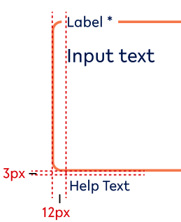
Specifications
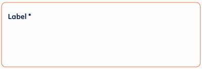
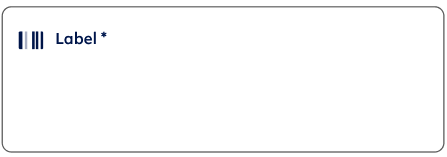
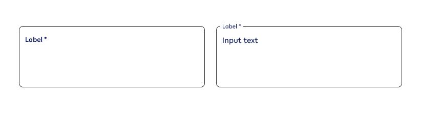
The mandatory/ required state is indicated by an asterisk (*) at the end of the label.
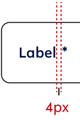
Text style - style of the related label (for this instance: label1)
Text colour - style of the related label (for this instance: primary)
Possible combinations
This option can be combined with all other options
How to find variant in Figma
Figma variations
|
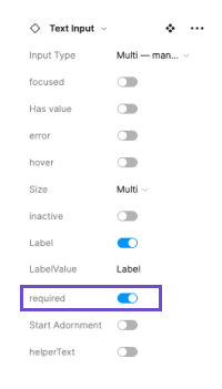
When a textfield should be required, the ‘required’ can be switched on. The default state should be switched off. |
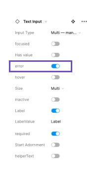
Option C - Error state
|
Example - NO |
Example - YES |
|---|---|
|
text-multi-noValue |
text-multi-noValue-error |
|
Use when
|
Use when
|
|
Don’t use when
|
Don’t use when
|
Possible combinations
This option can be combined with all other options.
How to find variant in Figma
Figma Playground → https://www.figma.com/file/F1fNT99VGTJHJ1jAnjFTn6/Youtap-Style-guide-V1.0.2023?type=design&node-id=1361%3A69988&t=rkaRCEh0IZ21rS40-1
Figma variations
|
When the value is not matching for a required field, it fires an error. This 'error’ state can be switched on and off. The default state should be switched off. |
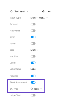
Option D - Start Adornment (sA)
|
Example - NO |
Example - YES |
|---|---|
|
text-multi-noValue |
text-multi-noValue-sA |
|
Use when
|
Use when
|
|
Don’t use when
|
Don’t use when
|
Specifications for Start Adornment
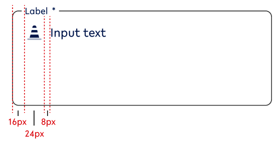
Icon size - 24x24px
Colour - needs to be set in the primary colour scheme
Possible combinations
This option can be combined with all other options
How to find variant in Figma
Figma Playground → https://www.figma.com/file/F1fNT99VGTJHJ1jAnjFTn6/Youtap-Style-guide-V1.0.2023?type=design&node-id=1361%3A69988&t=rkaRCEh0IZ21rS40-1
Figma variations
|
A multi-line textfield can have a start adornment. The default state is switched off.
When switched on, an icon can be selected from our icon library that supports the context of the textfield. |
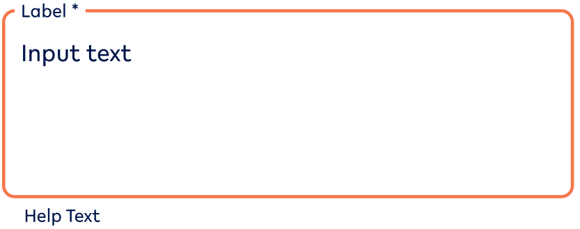
Option E - Help text
|
Example - NO |
Example - YES |
Example - YES |
|---|---|---|
|
text-multi-noValue |
text-multi-value-help |
text-multi-value-default-error-help |
|
Use when
|
Use when
|
Use when
|
|
Don’t use when
|
Don’t use when
|
Don’t use when
|
Specifications
Text size - label2
Text colour - primary (for inactive - tertiary-black-60)
Possible combinations
This option can be combined with all other options.
How to find variant in Figma
Figma Playground → https://www.figma.com/file/F1fNT99VGTJHJ1jAnjFTn6/Youtap-Style-guide-V1.0.2023?type=design&node-id=1361%3A69988&t=rkaRCEh0IZ21rS40-1
Figma variations
|
|
A multi-line textfield can have a start adornment. The default state is switched off.
When switched on, an icon can be selected from our icon library that supports the context of the textfield. |
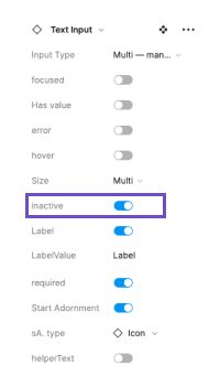
Option I - Active/ Inactive
|
Example - active |
Example - inactive |
|---|---|
text-multi-value - active |
text-multi-value-inactive |
|
Use when
|
Use when
|
|
Don’t use when
|
Don’t use when
|
Possible combinations
This option can be combined with the ALL options EXCEPT:
-
Option C - Error state
How to find variant in Figma
Figma Playground → https://www.figma.com/file/F1fNT99VGTJHJ1jAnjFTn6/Youtap-Style-guide-V1.0.2023?type=design&node-id=1361%3A69988&t=rkaRCEh0IZ21rS40-1
Figma variations
|
A multi-line textfield can be inactive if the user is not allowed to change the input. The default state is switched off. |
02. Usage and behaviour
Standard States
Default state
Default

Use when
|
Don’t use when |
|---|---|
|
|
Error

|
Use when |
Don’t use when |
|---|---|
|
|
Hover state (Desktop ONLY)
Default
|
Use when |
Don’t use |
|---|---|
|
|
Error
|
Use when |
Don’t use when |
|---|---|
|
|
Focus state
Default
|
Use when |
Don’t use when |
|---|---|
|
|
Error

|
Use when |
Don’t use when |
|---|---|
|
|
Inactive state
|
Use when |
Don’t use when |
|---|---|
|
|
03. Interaction behaviour
Whenever there is a form the textfields follow the following order of states:
|
Input field variant |
Visual reference |
User behaviour |
|---|---|---|
|
DEFAULT BEHAVIOUR |
||
|
Default Var A → |
|
User has not yet selected the input field and there is no input yet. |
|
→ Focused Var A → |
|
User selects current input field and starts entering the required value of the field. |
|
→ Default Var B |
|
User has finished their input and moved on to another input field. |
|
ERROR IS TRIGGERED |
||
|
Error Var A |
|
User has not yet given input to a required field, but has pressed a CTA to move forward OR started entering value for the next input field. (this usually includes a helptext) |
|
Error Var B |
|
User has added value to the input field, however, it does not match the input. (This usually includes a helptext) |
|
HELP TEXT GETS DISPLAYED |
||
|
Error Help Text |
|
User has entered the wrong input and gets an error message. |
First editable input field on a page
This input field is automatically set to Focused Var A.
Prototype for auto-layout interaction behaviour https://www.figma.com/proto/F1fNT99VGTJHJ1jAnjFTn6/Youtap-Style-guide-V1.0.2023?page-id=870%3A69112&node-id=1098-73226&viewport=26%2C-2127%2C0.75&scaling=min-zoom&starting-point-node-id=1098%3A73226&show-proto-sidebar=1
Multi-line behaves the same way as single-field input.
04. Accessibility
For textfields, follow the WCAG2.0 - AA standard for colour, readability and other relevant considerations for textfields.
05. Resources
|
Resource |
Link |
Notes |
|---|---|---|
|
Figma file |
further includes single-line inputs |
|
|
WCAG2.0 Checklist |
https://www.w3.org/TR/2006/WD-WCAG20-20060427/appendixB.html |
|
|
Figma Prototype for interaction behaviour |
auto layout prototype |
|
|
Checking colour accessibility compliance |
Design https://www.figma.com/community/plugin/733159460536249875/A11y---Color-Contrast-Checker Final check https://www.figma.com/community/plugin/911262488575486588/Contrast |
Aiming for AA if AAA, even better |
|
Figma Playground |
Figma Page to try out different components and how they work in Figma |