
Introduction
Sliders are used to require an action from the users to confirm their selection. Through the movement, it implies that the action is moving to the next stage.
Figma component - Slide to confirm
This chapter includes the following:
01. Usage & Specifications
Use this component for the following scenarios:
-
When something needs further emphasis with the sliding motion to confirm a specific option chosen
slideToConfirm-default
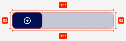
Specifications
height - 52px
width - 327px
colour - primary-20T
colour-confirmed - primary-80T
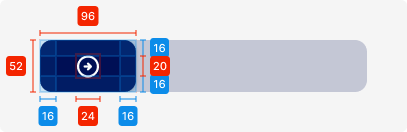
Slider-button
height - 52px
width - 96px
colour - primary
icon - 24 x 24px, tertiary-white
padding - SP_2
02. Interaction Behaviour
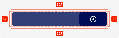
By sliding the button, the user needs to slide it from left to right completely for the action to take place.
Otherwise, it will collapse back to the beginning state.
03. Accessibility
The standard for accessibility should always be WCAG2.0 - AA compliance for colour contrast and readability of the text.
04. Customisation options for Products
|
Item |
Option A - Whitelabel |
Option B - Restricted custom |
Option C - Fully custom |
|---|---|---|---|
|
Label (text) |
✅ |
✅ |
✅ |
|
Colour palette (fitting the Youtap palette) |
✅ |
✅ |
✅ |
|
Font |
✅ |
✅ |
✅ |
|
Iconography |
❌ |
✅ |
✅ |
|
Typography |
❌ |
❌ |
✅ |
|
Spacing/ Padding |
❌ |
❌ |
✅ |
05. Resources
|
Type |
Link |
Notes |
|---|---|---|
|
Figma file |
|
|
|
WCAG2.0 Checklist |
https://www.w3.org/TR/2006/WD-WCAG20-20060427/appendixB.html |
|