
Introduction
Indicative UI extends to various elements, including pagination indicators that guide users through content and selection indicators that enhance user interaction. By adhering to these principles and incorporating these elements, we ensure that our user interfaces not only reflect our brand identity but also enhance the overall user experience. Indicative UI empowers our design and development teams to collaborate effectively, fostering creativity within a structured framework, and ultimately leading to efficient, on-brand, and user-friendly digital products.
This section includes the following components and their variations:
Components
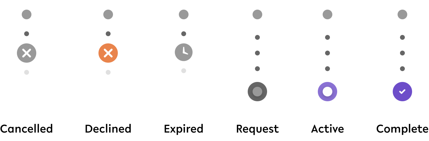
01. Schedule Status Indicator
Figma component - Schedule Status Indicator
This component is a base component of the Schedule UI component. All specifications and use cases can be found here.
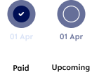
02. Paid date indicator
Figma component - Paid date indicator
This component is a base component of the Schedule UI component. All specifications and use cases can be found here.
03. Background selector
01. Specifications & Usage
Figma component - Background selector
This component is used in the following scenarios:
-
An account is set up and the user can select the colour/image the account is displayed in
background-selector

Specifications
width - 224px (depending on amount of choices)
height - 24px
space between elements - SP_2
02. Interaction behaviour
Initial state
When a user lands on a page that allows the user to change the background, the first background option is selected.
Changed selection

After clicking on a different option, this option becomes selected. The initial option becomes deselected.
The background the selector relates to will change the background accordingly.
04. Account PIN - verification
Figma component - Acount PIN - verification
This component is a base component of the PIN Entry component. All specifications and use cases can be found here.

05. Current Page Indicator
01. Specifications & Usage
Figma component - Page Control_Indicator
This component is used in the following scenarios:
-
Whenever there are more options available and the user needs to swipe left/ right to view the other options, e.g. shortcuts
page-control-indicator
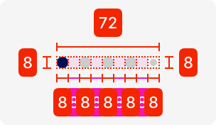
Specifications
width - 72px (depending on amount of options)
height - 8px
space between elements - SP_1
02. Interaction behaviour

Initial state
The first option is selected whenever a user lands on a page that showcases different options that can be swiped between.
Changed state
Afterwards, the user can swipe left or right and the indicator moves accordingly.
06. Tag
01. Specifications & Usage
Figma component - Tag
This component is used in the following scenarios:
-
To provide an indication of a certain status, e.g. verified for KYC
tag
02. Interaction behaviour

Depending on the function of the tag, the user can click on it and it opens up an overlay with necessary information.
07. Loading indicator
01. Specifications & Usage
Figma component - Loading indicator
This component is used in the following scenarios:
-
When a feature has a time limit before it becomes invisible again due to sensitive content, e.g. the App PIN
loading-indicator

Specifications
width - 295px
height - 20px
colour - linear gradient (#928BF0; 000B3F)
02. Interaction behaviour

Initial state
The loader is fully filled and reduces length depending on the amount of time that is set for the user to view a certain feature.
Afterwards, it resets to the locked state.
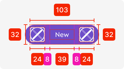
07. Nav/ Card Request Indicator
01. Specifications & Usage
Figma component - Nav/Card_request types
This component is used in the following scenarios:
-
Only used within card management to select which card you want to order
nav/card-indicator
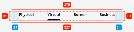

Specifications
width - 375px (full length)
height - 31px
padding left/right - SP_3
spacing between elements - auto (depending on amount of elements shown)
02. Interaction behaviour
Initial state

Changed state

Landing on the card request area, the first option that is selected is ‘Physical’.
Afterwards, a user can switch to Virtual, Burner, or Business by clicking on them or swiping between them.
08 Story Page Indicator
01. Specifications & Usage
Figma component - Story Page Indicator
This component is used in the following scenarios:
-
Only used together with stories
-
Only used when there needs to be further explanation on onboarding/ features
story-page-indicator

Specifications
length - 279px (depending on the pages shown)
height - 34px
Space between elements - SP_1
02. Interaction behaviour
When starting the story, the first indicator is empty, but fills up with the amount of time set for the page to view.
Then it moves to the 2nd indicator to start the 2nd part of the story, and so forth until the last one.
Accessibility
For indicative UI, follow the WCAG2.0 - AA standard for colour, readability and other relevant considerations for indicative UI elements.
Figma plugins to check AA accessibility
Best for designing or exploring
A11y - https://www.figma.com/community/plugin/733159460536249875
Best for final check
contrast - https://www.figma.com/community/plugin/911262488575486588
Resources
|
Resource |
Link |
Notes |
|---|---|---|
|
Figma file |
|
|
|
WCAG2.0 - Checklist |
https://www.w3.org/TR/2006/WD-WCAG20-20060427/appendixB.html |
|
|
Contrast checker |
Design/Exploration https://www.figma.com/community/plugin/733159460536249875 Final check |
|