
Introduction
PIN input is required when logging into the app or for extra security reasons. We are following the same states for the PIN input as for every other input field.
This section includes the following:
https://www.figma.com/file/F1fNT99VGTJHJ1jAnjFTn6/Youtap-Style-guide-V1.0.2023?type=design&node-id=36%3A12840&t=DwJbVWImPjudxAWy-1
01 PIN Entry Specifications
01-0 Overview
Component - PIN Entry
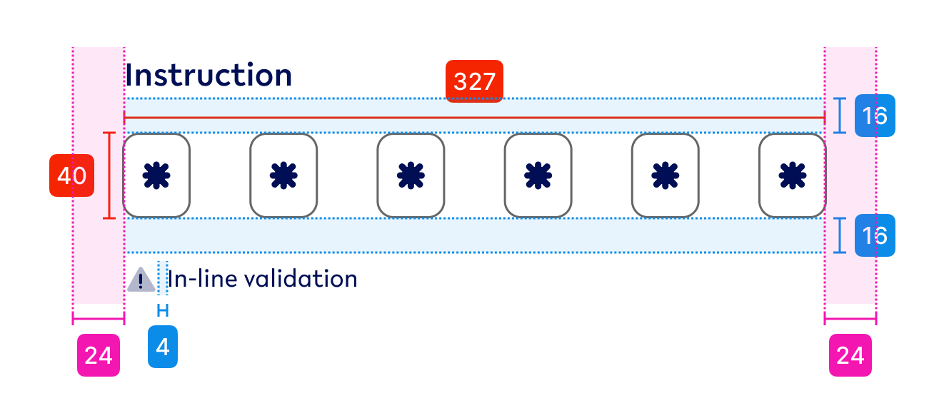
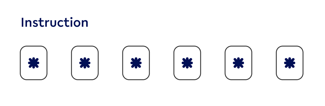
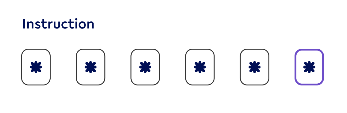
01-1 PIN entry fields
|
Visual |
State |
Specs |
|---|---|---|

|
Default PIN-value |
colours - tertiary-black-60 (outline), primary (value) outline weight - 1pt, inside |

|
Focused PIN-value - focused |
colours - secondary1 (outline), primary (value) outline weight - 2pt, inside |
|
Hover PIN-value - hover |
colours - tertiary-black-80 (outline), primary (value) outline weight - 1pt, inside |

|
Default - Error PIN-value - error |
colours - secondary2 (outline), primary (value) outline weight - 1pt, inside |
01-2 Help Text (optional)
|
Visual |
State |
Specs |
|---|---|---|
|
Help text (with icon) |
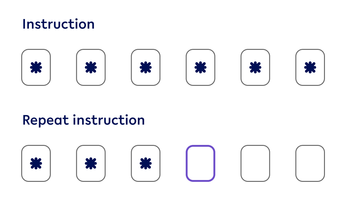
01-3 Repeat PIN

Contains
-
2x PIN entry field
-
Padding between elements - 24px
02 - PIN Entry - Usage & Application
Default state
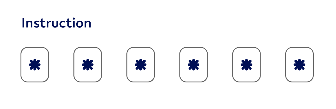
Use when
-
When the PIN entry field is not selected
NOT use when
-
an error occurred within the entry field
-
a field is selected
Hover state (Desktop ONLY)
Use when
-
mouse hovers over the related PIN entry component
NOT use when
-
an error occurred within the entry field
-
a field is selected
-
a field is not selected
Focused state
Use when
-
User is currently interacting with the related PIN entry field
NOT use when
-
user is not currently interacting with the current PIN entry field
-
an error occurred
Repeat PIN
Use when
-
PIN is set up
-
PIN needs to be entered a second time
NOT use when
-
PIN is only needed for validation
Error state

Use when
-
leaving the PIN entry fields and the data don’t match between 2 fields
-
User is amending an error field until it has been validated
NOT use when
-
the is an error in the textfield, however, it is not mandatory
-
When a user is entering the PIN entry for the first time
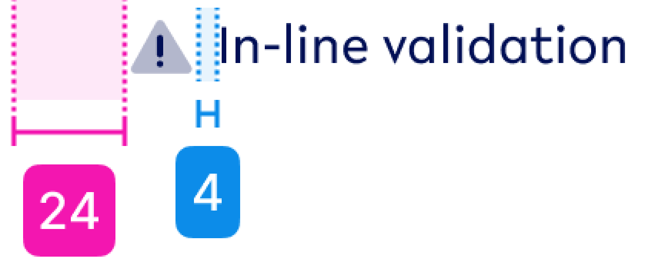
Help Text

Use when
-
An error occurs
-
additional text is required to inform users what information is required from them
NOT use when
-
there is no error related to the input of this ‘text input’
-
it is a standard input that is necessary